


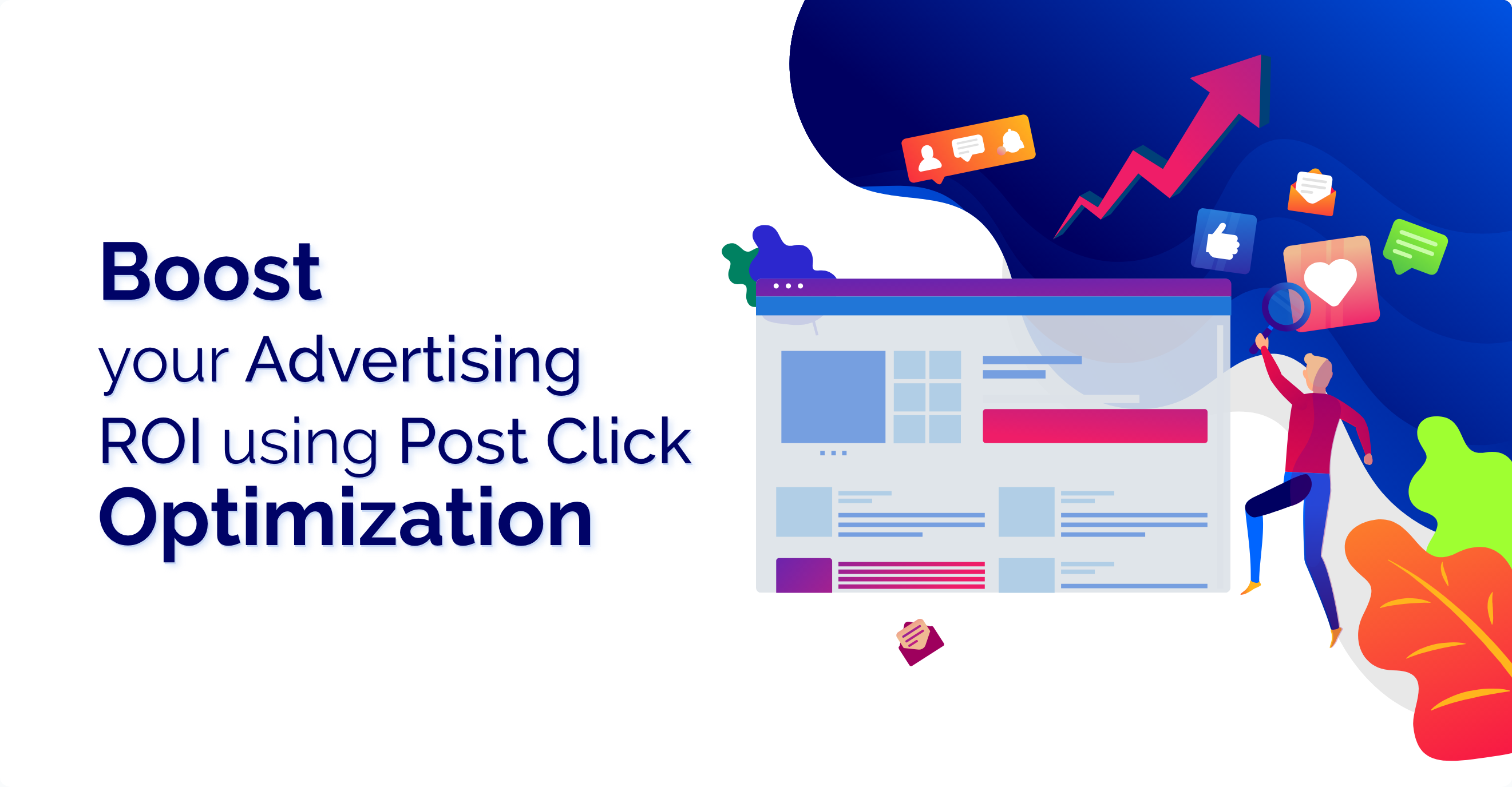
Facebook ads, Google Adwords, Bing, branded call to actions, display ads and many more mediums consume humongous advertising budgets for lead generation
All this effort and yet the ad conversion rate of most valiant marketers is just 3 – 4%. 97% of their endeavors are not fruitful. WHY IS THIS HAPPENING???
The reason behind this is advertisers focus 97% of their energy in urging the user to make the leap of faith by clicking the ad. Persuasive CTA, engaging content, ad placement strategy, campaign budget, all attribute to one common cause, “Please click our ad”
But what happens after they have clicked your ad, How do you nurture that click to hatch as a sale.? Post-click optimization is the science that seamlessly transforms your click/ lead to a genuine sale.
Nobody wants to live in a half-finished building or see one half of a game. There are many platforms and tools that allow marketers to create an audience and target these same audiences with the correct organic or paid campaign.
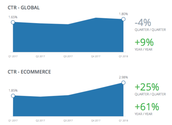
From the above image, we can clearly see how the display ads are performing around the globe. An overall increase is seen in the average CTR but look at the figures. 1.8% CTR, globally, is alarmingly low. Imagine the amount of budget wasted by not utilizing the 97%.
What is Post Click Optimization
All activities taking place between the ad click and the actual conversion falls in the category of Post click optimization. It ensures that consumer follows the path of least resistance where they want to watch, listen, and shop—making the customer journey truly personal. The starting point of this process is an optimized landing page and ends with a personalized thank you page and an email.
An essential part of post-click optimization is the coherence between the ad and the landing. All elements of the landing page such as taglines, images, and brand coloring should be unified with the and in sync with the ad. This enables the user to establish logical consistency paving the way to the sale.
Let us see an example to probe this further
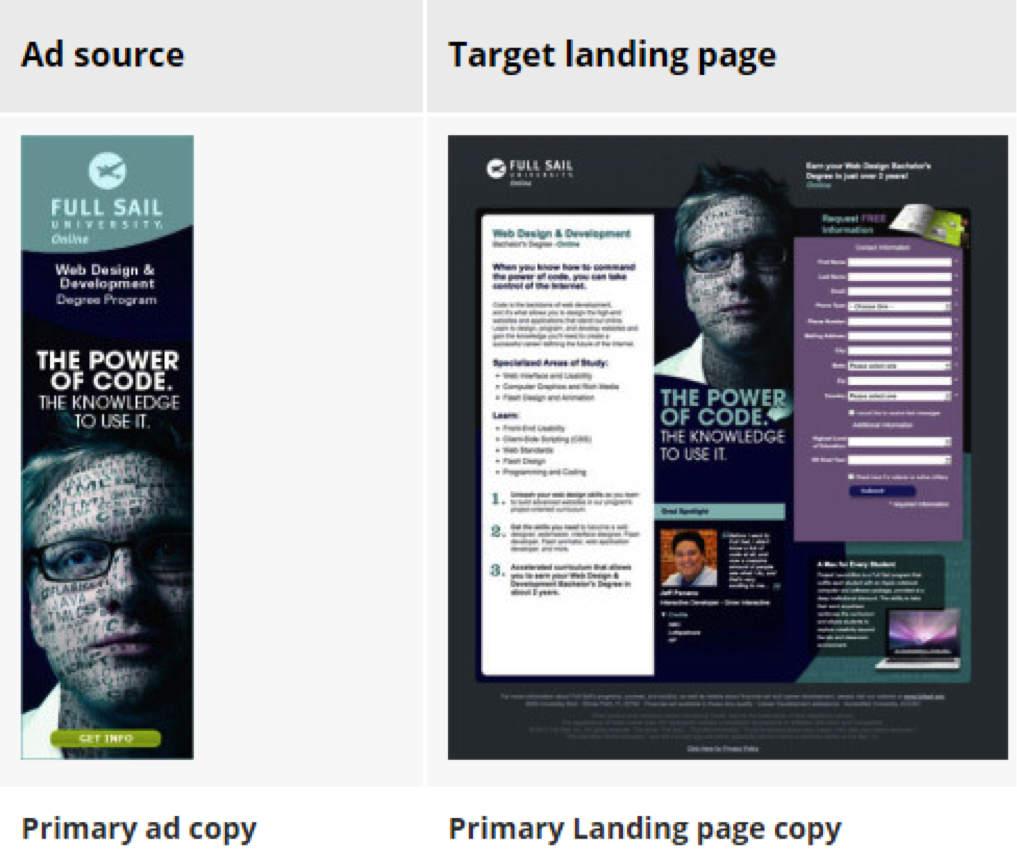
Full Sail University is a private, for-profit university in Winter Park, Florida. It was formerly a recording studio in Ohio named Full Sail Productions and Full Sail Center for the Recording Arts. Looking at their ad copy and landing page we can deduce the following.
- The banner ad and the landing page are almost identical w.r.t design and message
- The background image used in the ad and landing page are same
- The color scheme is kept consistent to ensure relevance
A similar trend should be followed in the thank you page.
Why does pre-click experience get preference
Pre-click optimization encompasses all activities pertaining to the creation of paid marketing ad campaigns using platforms such as Google Ads, Bing, and Facebook. It focuses on a single element, the ad. The ad comprises headlines, URL’s, ad copy, images, and video.
The advertising powerhouses have always focused on ad creation. This is the reason why pre-click optimization has always been in the limelight is that they developed advanced advertising and marketing techniques which have not only increased the number of ad clicks but also saved marketer’s revenue, time, and resources.
Basic elements of an optimized post-click optimization experience
Scalable creation
Scalability emphasizes the creation of multiple post-click experiences to multiply the post-click experience quickly. This technique is mostly applied to ads referring to eCommerce stores.
Picture this scenario for example, if you want to offer a black Friday sale on 30 items. It is advisable as well as sensible to make 30 landing pages, one for each item.
In contrast to this, if you have a single landing page for all of the 30 items, there is no customization, no personalization and there is a high chance of traffic clogging, that is if you are lucky.
Now use your imagination to determine which of the two strategies will have a better conversion.
Personalization
Leading the way from click to conversion, a digital marketer must keep in mind the user intent. A person who just arrived at your page and one that is about to check out, both have different intent and must be catered for beforehand.
Catering for both scenarios not only helps you personalize the user experience and but the end result i.e. conversion more likely.
1:1 Conversion Ratio
The conversion ratio is defined as the number of clickable elements on a page to the number of actual conversions via those elements. A clickable element is usually a well placed and well designed CTA.
A landing page is an individual web page meant to promote a single offer (conversion goal). Hence 1:1 conversion ratio can be defined as “A singular link that takes the user away from the page and that link should be the CTA”.
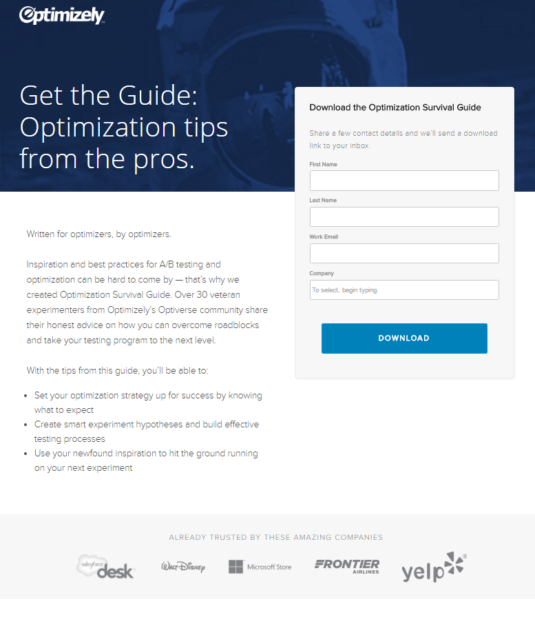
Let’s see an example of a 1:1 conversion ratio landing page
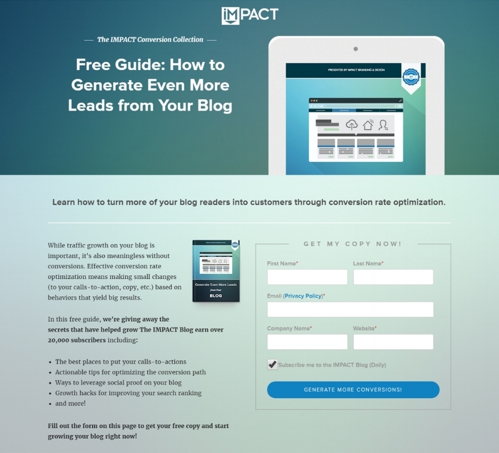
This landing page used by “IMPACT” provides a free guide on “ How to generate more leads” to its visitors. Following are the highlights of their landing page.
- The logo in the top header is not linked and the page is completely free of navigation links.
- The page is promoting IMPACT’s free guide and all the landing page elements—the headline, copy, image, and form—are relevant to the offer.
- The CTA button is the only place the visitors can click, and it takes them to the thank you page with the free guide.
Businesses spend a lot of money, time and effort ensuring they target the right audience. It is imperative for them to eliminate off-page links and keep the visitors focused on the offer at hand.
Use of White Space
A general tendency seen in an effort to design a powerful landing page is putting in more information. This is not true. When it comes to landing pages, less is definitely more.
A good practice used by experienced designers is the use of white space. White space is the part of a web page that’s left blank or unmarked. This includes the space between images, copy, CTA button, etc.
The thing about using the white space is when it is optimally used, it is barely noticeable. This is what makes using white space ever more difficult.
Using appropriate white space on your landing page not only declutters the page but at the same time highlights what’s really important, the CTA.
A Contrasting CTA Button
The CTA on a landing page has to be the most crucial element. All marketing strategy, page design, and ad copy narrow down to this single component.
Naturally, the CTA should stand out from the background and surrounding elements so the visitors are drawn towards clicking it. But before they can do that, they have to view it.
The size, shape, copy, color all impact whether a visitor notices your button. The best way to do that makes it contrasting.
It should be the most prominent feature on your page. To achieve that, the color of the button is your biggest ally. The perfect color would be the one that is vibrant than other colors on your landing page. The hue, shade, tint you choose should be bright, bold, and one that’s used on no more than 10% of your landing page.
Check out this amazing CTA from ContentStudio
The critical elements are contrasting and the message is clear as daylight.
Optimized Thank you page
The final piece of this puzzle is the Thank you page. This page serves two purposes at the same time. One, it acknowledges the visitors for conversion and secondly, it gives you another conversion goal. The thank you page should include
- A thank you note for the visitor
- An image of the offer (usually the cover page)
- Instructions how they can access the offer
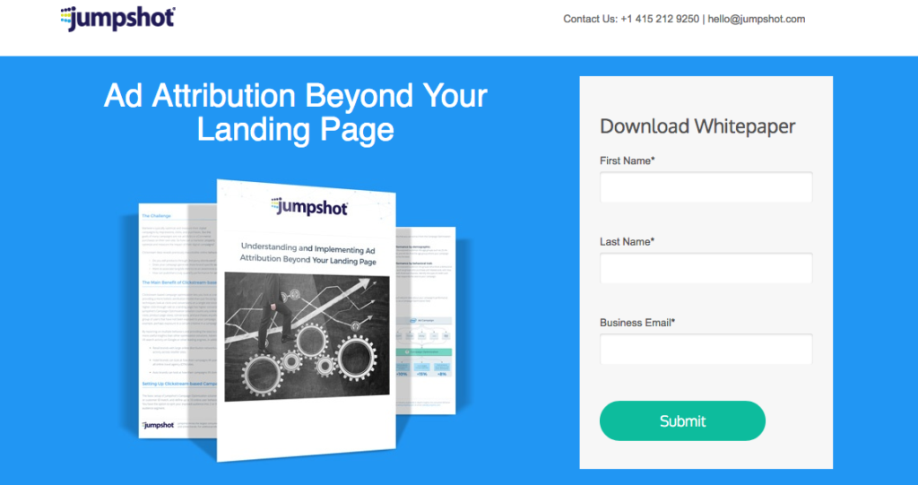
You can also cross-sell but not in an obvious way and the offer should be relative to the actual sale. A good example is Jumshot’s landing page and thank you page.
And after this the thank you page looks like.
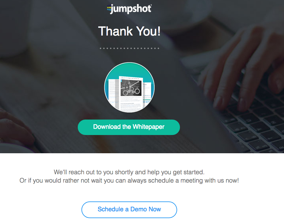
The contrasting CTA on the thank you page is a perfect example of how to efficiently use the button. The first CTA gives you access to the paper.
The message below that conveys the visitor should expect an email soon.
The “Schedule a demo” button takes the engagement to the next level. This presents another conversion opportunity for the platform.
Track ROI
More than 81% of businesses tend to invest in more when they can track ROI.
You can track the number of leads generated by your specific page with a CTA directing users to the signup page or even email conversions.
Then turning these figures into revenue figures ( conversions ).
You can use an ROI Calculator or Replug’s conversion tracking element to help you keep track of your ROI.
Master Post click Optimization for better ROI
To put it all in a nutshell, following these checkpoints to help yourself to better conversion rates.
- Does your ad have a dedicated, messaged matched landing page
- Make sure you ad clicks do not go to waste
- Ensure a 1:1 conversion ratio on your landing pages
- Take your time while designing the CTA
- Use ample yet appropriate white space
- Never forget to link a thank you campaign to your ad
If you have other techniques to increase the conversion rate, do share in the comment section.