Over 10 years of blogging has taught me a million things about launching, optimizing, growing, increasing CTR and selling websites. What if I told you figuring out two things that could turn things around for you? The first is “how to bring visitors to your site” and the second is “how to push them to click on your website.”
If you have been running a website, you’d know that clickability is a massive factor of engagement and conversion. You can’t sell your product or convert a reader into a subscriber if visitors aren’t clicking. It does look so simple on the outside, but it’s a game-changer in conversion optimization.
What if your website visitors don’t know where to click? Or what if they know what exactly you’re offering but they don’t want it?
Wait. No need to feel depressed.
I’ll walk you through the whole process that will surely help you maximize the website conversion. All you need is to be ready to churn the information I’ll throw at you as I’ve got several ways to increase CTR to improve your website conversion.
You should know that every e-commerce store, website owner, and blogger wants more conversion on the website. Some improve their website designs, while others internally link their website pages. The goal remains the same; they want prospects to convert into paying customers.
But when visitors aren’t clicking anywhere on the website, then it got to be something wrong with the website. The primary suspects could be the website speed that may be affecting the ranking, the quality of content that isn’t impressing the readers, or the wrong audience targeting that result in producing irrelevant content.
If you’re wondering why it would matter so much, then you should know that less or no clickability affects a lot of things, such as:
- Total page views
- Email list growth
- Affiliate commissions
- Product sales
Since we’re discussing how we can improve the click-through rate for better conversion, it’s imperative to know where website visitors are clicking and where you want them to click. Placing a banner ad on the sidebar or installing an exit-intent won’t make a difference unless you aren’t getting the right traffic to your blog or website.
In the online marketing world, click-through rate (CTR) is crucial to understand various factors that indicate whether or not the content strategy is working, and those factors include but limited to:
- The intent of the publisher mirrors in the way content is presented
- The interest of the visitors in your content is determined by the engagement
- Relevance to the audience reflects in the bounce rate report
- Quality of the content can be judged through the conversion
So we’ve established that it’s necessary to have clickability on our website or blog. Therefore, now you need to know is how you can increase clickability on your site.
Let’s head over to the cream of this article.
7 Ways to Increase CTR for Better Conversion on the Website
Let’s change the way website visitors respond to your websites and blogs for the better. Take a look at the methods to increase CTR on your website:
Link to sales page multiple times
One of the common mistakes website owners and bloggers make is that they add a single call-to-action button or link once to their sales page in the article. They should know that it isn’t going to cut it. On the other side, what smart marketers do is that they use psychology to push visitors to click-through by adding multiple call-to-actions.
It’s human nature that when something appears frequently, it goes into our subconscious mind and influences our behaviours. Brands know this very well. They’d spend millions of dollars on TV commercials, social media ads, and influencer marketing to build brand recognition.
The point I’m trying to make is that you need to link to your sales pages more often. This linking shouldn’t be limited to the blog posts, but instead, you can do this in other content mediums as well. Here’s how you can link to sales pages on various platforms:
Since our goal here is to improve the website conversion, so the first thing you should do is start linking to your sales page more often.
When I promote products, I tend to link to those affiliate products more often.
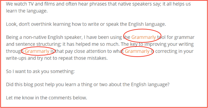
Take a look at the example:
Ever since I started linking to the affiliate promotes multiple times in the blog post, my conversion rate needle has started to move. So don’t waste this opportunity to improve your CTR on the site.Add various call-to-action buttons on the website. You can try out multiple CTA variations such as buy now, free trial, sign-up now, get access, et cetera. It increases the clickability when the call-to-action button appears in multiple places on the website pages.
Link to money pages multiple times in the articles. One of the underrated engagement techniques that bloggers and digital marketers don’t capitalize on is linking to money pages. Income School once revealed that they increased their conversion just by adding links multiple times in the blog posts.
Mention CTA at least twice in a podcast so that the listeners could remember your brand or offer once they finish listening to the podcast. I’m a big fan of podcasts, and I know how much attention listeners pay to their favourite content. Almost every podcaster has a specific call-to-action, whether it’s a freebie or a discount coupon.
Highlight the product at the beginning and at the end of the video. Video is a popular content type on social media. So when you put out a video on YouTube or Facebook, try to plug in the call-to-action at the beginning as well as at the end of the video.Add a comparison table
You got to be on your toes when you’re trying to increase your website click-through rate. There are several factors that determine how good or bad your clickability is going to be on the website. One of the key factors is “stopping people from leaving your site.”
So when you essentially stop people from leaving your website, then it means they’re either enjoying your content or interested in your product. Therefore, you have to try out every single method to stop people from hopping to another website.
Adding a comparison table is a fantastic way to retain the visitors on the page and engage them further on your website. What comparison tables do is that they provide data, statistics, or specs, which essentially help the website to keep the visitors engaged.
It’s easier to engage the website visitors when they’re digging deeper into the information you’ve provided in the content. There are various comparison tables you can create to make this engagement happen:
i) Products comparison
ii) Pros and cons of a product
iii) Head-to-Head brands analysis
iv) Different variants of a product
It reminded me of the Wirecutter website; it’s a product review website that puts out a lot of content related to IT, tech, and gaming. They’re so good at using comparison tables.
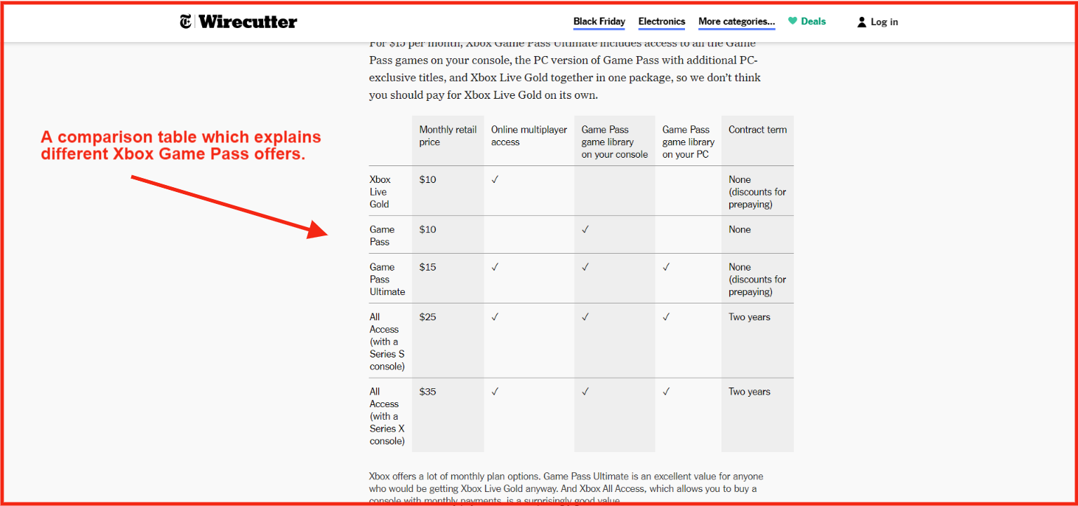
Take a look at the comparison table from Wirecutter:
The point is that sometimes when you need compelling information or data to tie readers to your content. The longer they stay on your website, the higher the chance of clickability.
However, in some cases, you need some call-to-action in your tables, for instance, read more or buy now to make sure that the engaged visitors take action. So don’t let go of any chance you get to retain the audience on your website.
Use attractive call-to-action buttons
The attractive call-to-action buttons have a lot to do with the click-through rate on the sign-up pages and online forms. Besides building a narrative, it also sends out a psychological message to the viewer. Digital marketers, web developers, and bloggers know how important the text, colour, and size of the call-to-action buttons are. Therefore, they pay close attention to testing out various versions of the call-to-action buttons.
The importance of building attractive CTA buttons isn’t limited to websites, but they also matter in online ads and mobile app interfaces. Have you ever wondered what makes good CTA buttons better than the average CTA buttons? Here are three key factors that differentiate good and bad CTA buttons:
i) Intent
The CTAs must align with the intent of the publisher. Suppose a blog is about making money online, and the CTA button is about health and fitness, then it won’t work. There has to be coherence between the content and the text of the CTA button.
ii) Clarity
It’s true that mundane and regular CTA buttons go unnoticed, for instance, “get updates” and “subscribe” are the most common ones. Sometimes, websites and blogs try to fashion CTA buttons and end up writing a word or phrase that doesn’t give out a clear sign of what to expect from the sign-up process. So try creating a clear CTA button that helps the visitor in moving forward.
iii) Message
A core element of the CTA button is the message it carries. Not only it matters in understanding the context but also influences the clicks. The clearer the message, the better the CTA.Call-to-action buttons are essential everywhere on your online real estate whether it’s a website, newsletter, landing page, or article copy.
The team at Elegant Themes understands the importance of attractive call-to-action buttons.
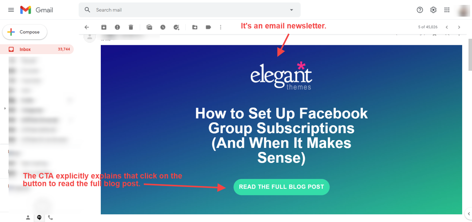
Look at the CTA button in one of their newsletters:
They used a rather large CTA button and clearly hinted “read the full blog post” on the call-to-action button, which explains the point.
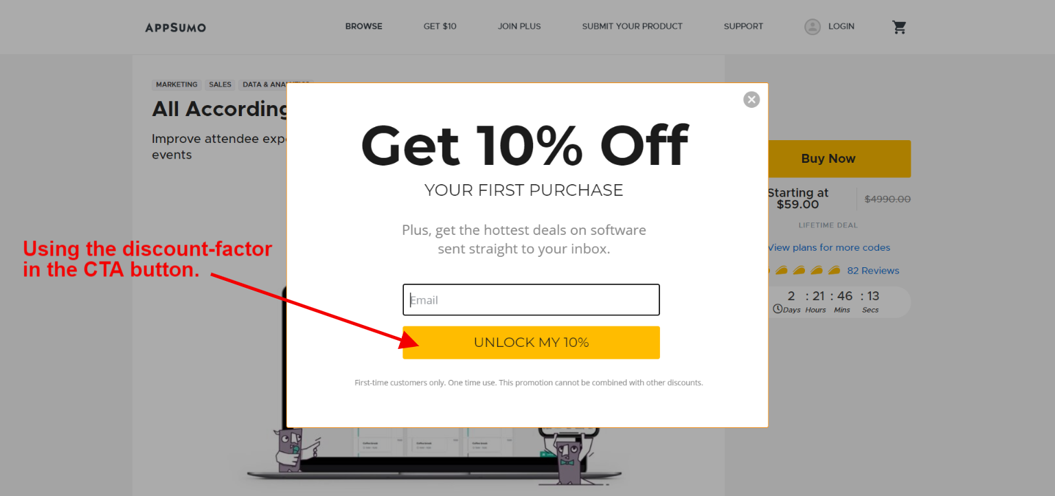
Similarly, Appsumo also has an interesting call-to-action button on a popup option box:
Not only did they use the discount offer in the CTA button, but they’re also using a contrast colour for their call-to-action button.
Both of these examples sum up what I’m trying to tell you, which is to make attractive call-to-action buttons for more clickability and better conversion.
Maximize internal linking in the content
Internal linking is a vital SEO tactic to keep visitors engaged and tell search engine bots about the relevance of your content pages. SEO experts and bloggers internally link their content or pages because it transfers link juice to other pages as well as keeps visitors and bots remain on the site.
If you have done SEO before, you might have an idea of what internal linking does to any blog or site. On the contrary, if SEO isn’t your cup of tea, then you might not have paid much attention to it.
Anyway, I’ll be keeping it digestible for you. The reason I’m discussing internal linking is simple: it increases click-through rate and engagement on the site.
Does this mean you should internally link your pages even if they aren’t relevant?
The answer is no. You shouldn’t do internal linking of the pages that aren’t relevant or won’t be helping the readers.
When your website visitors get engaged on the site, they either convert into a lead or buy the product. The key here is to somehow keep the visitors busy on your site.
The following three elements ensure that your internal linking strategy bear fruit:
i)Content Relevance
The internal linking doesn’t matter if you aren’t linking to the relevant content. If you’re connecting two pages for the sake of internal linking, and there is no justification whatsoever, then the reader who would end up clicking on the link might not feel clicking on any other link. So keep the content relevant in mind.
ii)Problem-solving Info
Your blog posts must be solving the problem. It does look so simple, but in reality, it’s not that easy. First, you’d have to identify a problem, and then you’d have to come up with a solution. Internal linking comes naturally in the content curation and creation process when you’re absolutely sure about the resources you’re linking out to in your content. Remember that the mission is to solve a problem, not to link out to other pages or resources. Once you keep this mindset, you’d succeed in internal linking.
iii)Clean Page Layout
Some of you might not agree with this, but I do believe that a clean page layout is worth it. If your blog post or website page is cluttered with ads, popups, and opt-in forms, then visitors might leave the site without clicking on any link. Don’t underestimate the power of having a clean layout on your site.
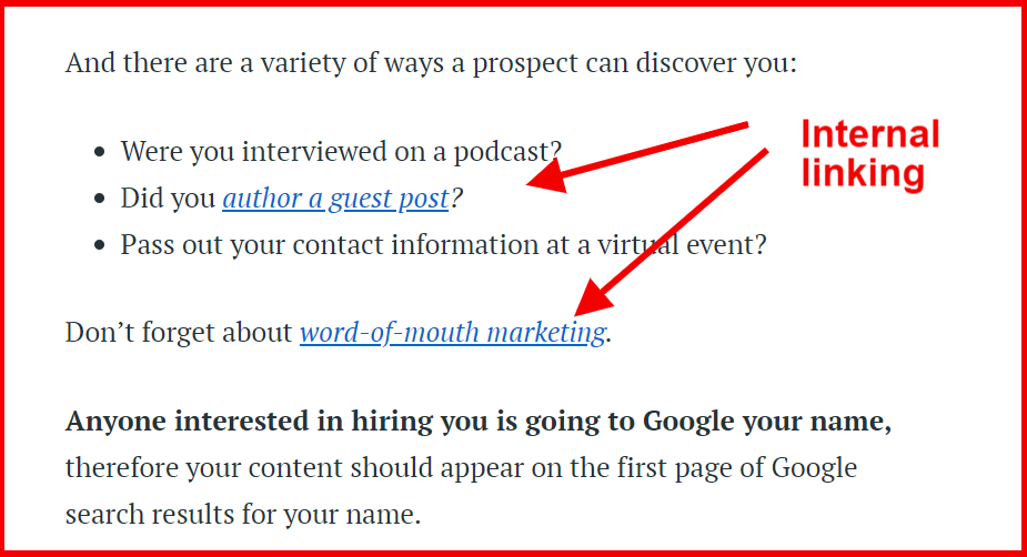 Copyblogger does internal linking so well:
I have been noticing their internal linking strategy for a long time. Often they hyperlink a full phrase, while sometimes they hyperlink a single word.
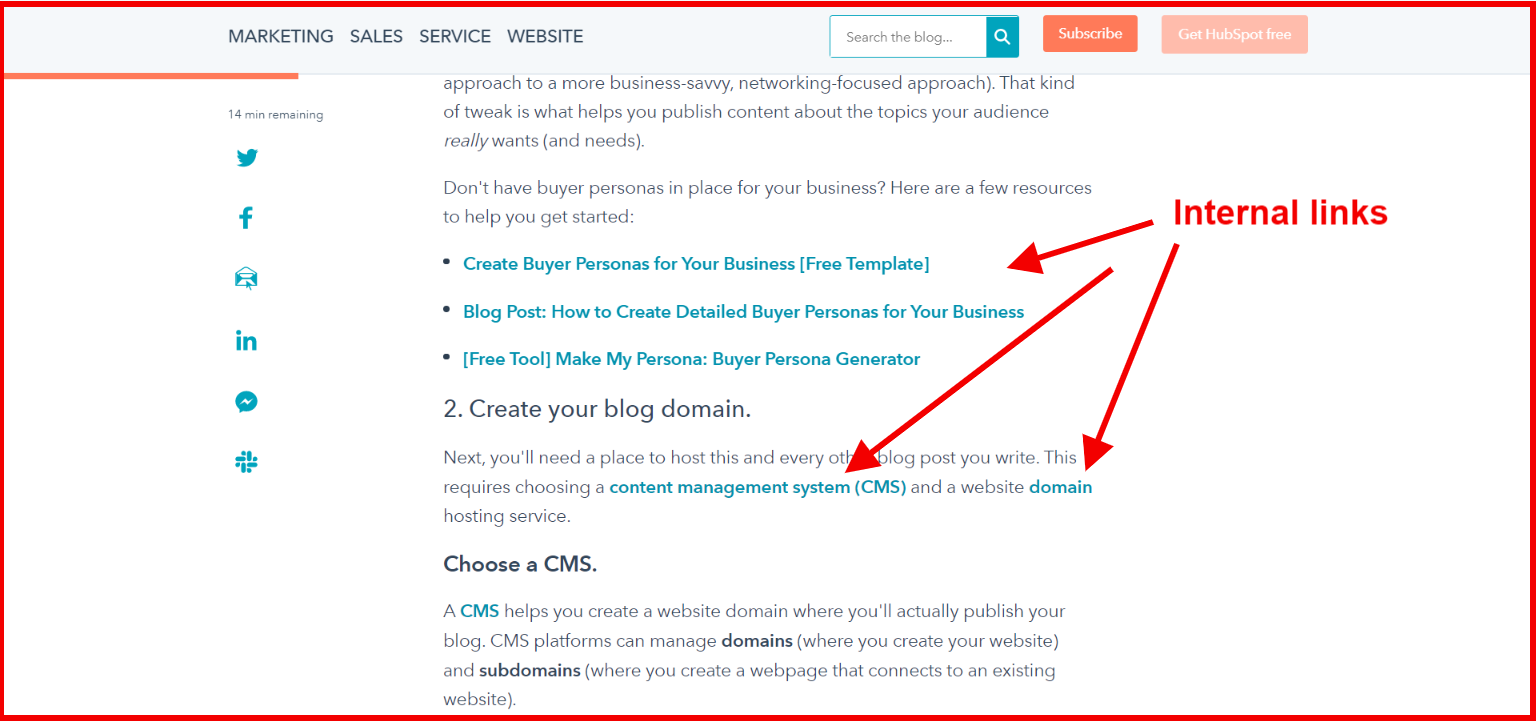 Hubspot is a popular inbound software services company. If you want to learn the basics of content marketing, you should follow their editorial techniques.
They nail it with their internal linking as well.
So what I’m trying to say is that internal link your pages and blog post wisely. Remember that the core reason behind internal linking is the delivery of value, not just drag the reader from one page to another. Once the readers start to discover helpful and meaningful resources through your internal linking, they’re likely to trust your content more than ever.
Reduce banner ads on the page
Most beginner bloggers don’t realize that adding more banner ads on the page could drastically reduce the clickability on the website, let alone reduce conversion. Understandably, they want to make quick bucks, so they put a lot of banner ads on the site.
As a result, they may end up getting a few clicks on their ads, but they could potentially lose the visitors they’d leave the site and land on the advertiser’s website.
One of the disadvantages of having a bunch of banner ads on a site is that visitors’ attention gets diverted towards the banner ads. Seemingly, it could reduce clicks on the internal links.
Furthermore, having more banner ads on your website means your page loading speed would increase, and that doesn’t just affect the user experience, but it could also affect your SEO.
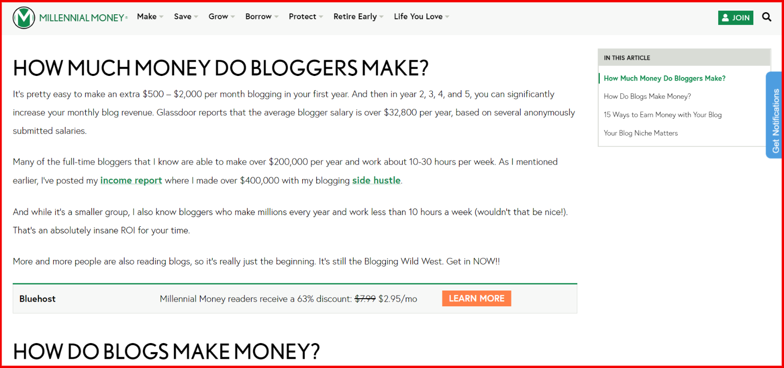
Take a look at the screenshot from Millennial Money blog:
It’s one of those blogs that have a minimalistic approach when it comes to their website designs. What I like about the Millennial Money blog is that they don’t have a single opt-in box or a banner ad on the sidebar of the blog posts. There are so many other blogs out there who follow the same approach.
So what we take away from this example is that sometimes having less number of banner ads could also lead to getting more clicks or higher conversion through internal links.
Make your text links standout
It’s fascinating to understand that users’ behaviour changes when our strategies to engage them to change. Plus, how small changes make a huge difference in the conversion rate and clickability. So I’m about to share another element of content marketing that would help you increase your website CTR, and therefore, impact the conversion.
You’re putting out great content on the blog and you have a fantastic internal linking strategy, but if your links aren’t prominent enough, then it’s a problem.
I’ve seen several blogs that don’t have a distinctive colour for their in-text hyperlinks, which prohibits the links from standing out from the rest of the content.
It’s necessary to know why we need to make our text links stand out in the first place. The reason is that we want clickability on the website and blog. Therefore, we add a bunch of internal links along with affiliate links and outbound links. The goal is to push readers to click on all types of clicks so that they go ahead and complete a specific action.
When a website gets more clicks, the following things happen as a result:
i) The website or blog gets more page views
ii) The engagement increases on the site
iii) More chances of affiliate conversion get created
iv)Display ads generate more money due to page views
So to make your text links stand, you need to choose the right combination of the following things:
Font: The font of the blog or website must be clean and decent. The font style and size play a vital role in pushing readers to read the blog or leave the page early on without finishing the blog post.
Text colour: After the website’s font, the next thing is the text colour, which should be prominent and in contrast to the body of the website body. It’s usually black in most of the blogs and websites.
Link colour: The link colour is a big decider of how clear and appealing a hyperlink appears in the content. If the link colour is the same as the colour of the text, it might hurt the clickability on the links.
Site template: The blog or website templates have settings where you can change the font size, colour, and hyperlink settings. You can adjust the text link colour if it doesn’t seem appropriate to you.
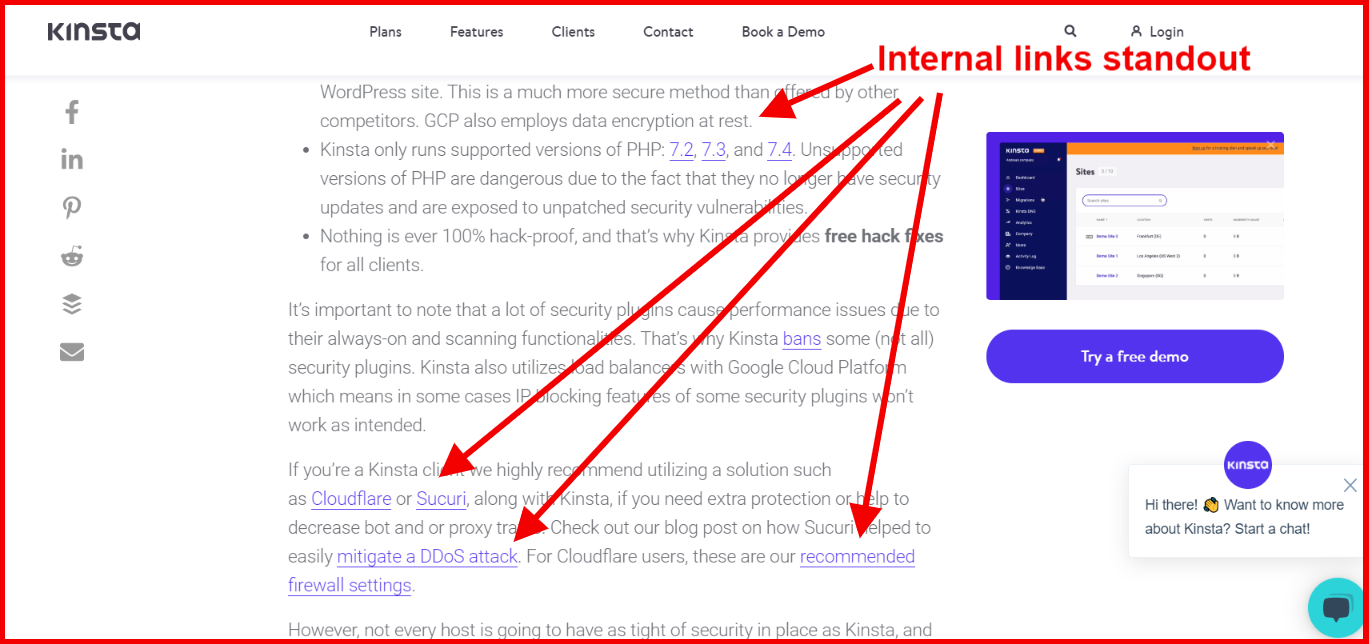
Look at the screenshot from the Kinsta blog:
It seems like they know about this so well. When I was going through their blog content, their hyperlinks were looking so catchy and clickable. The reason is clear, which is they’re standing out.
Try experimenting with your text link colours. If you have no idea where to change the colour of your hyperlinks in your site’s CSS, consult a website developer for this task. It’ll only take a few minutes to change it.
Use a Short Branded URL
Most of you would think, how come a short branded URL would bring website visitors or increase click-through rate? Well, all I can say is that you should keep reading.
First things first, what’s the short branded URL? If you have no idea what exactly a short branded URL is, then let me tell you. It’s a short version of the same domain with a different extension. Companies use short branded URL versions to reduce the length of the links as well as record different statistics.
If you’re into affiliate marketing, you might have noticed that Amazon and ShareASale allow users to generate the short URL of the affiliate products to promote.
The exciting part is that any company or blog can use a short branded URL. Now you’d think, why would someone want to use a short branded URL?
The answer is that a short branded URL could increase your CTR as well as land more website visitors on your website.
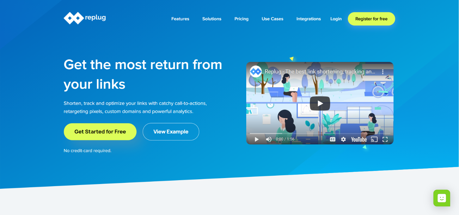
Well, Replug is a fantastic URL shortener that does so much more than just URL shortening. Not only does it allow users to use branded URL, but it also helps users drive visitors to their websites.
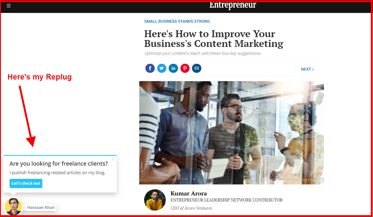
If you’re a social media expert or a pro-blogger, you might want to get your hands on this tool. Here’s why: when users shorten the article URLs with Replug and share on social media, and their followers click on the short links and land on the articles, they also see a small snippet of the users that could bring those random visitors to their websites.
What it means is that you’re sharing others’ valuable content with your followers after shortening the article URLs with Replug, and those articles could bring people to your website as well.
As a result, you could increase CTR on your website and end up improving your website conversion.
Did You Learn Something New About Increasing CTR on the Website?
I’ve shared seven ways to increase CTR on your website for better conversion. The goal was to help you out by sharing tactics that push visitors to click-through on your website.
I’m sure you’re going to take away a couple of strategies from this blog post. I’ll be thrilled to know what strategies you liked the most. Feel free to share what else readers should do to increase CTR on the website.
Furthermore, if you learned something good from this blog post, do let us know in the comments below.


