


Let’s play a game.
Think of the color “Blue”.
What comes to your mind?
The sky? Calm? Maybe “Monday blues”, or something cool and refreshing?
Now think “Red”.
How do you feel?
In danger? Energized? Bold? Maybe even a little anxious?
See what just happened?
Colors don’t just look different; they feel different. They shape how we perceive, react, and decide. In marketing, that’s where color psychology steps in. It’s a quiet force, often overlooked, but it speaks louder than you might think.
And that brings us to a crucial question: Can something as small as your call-to-action button color really influence clicks?
YES! It can.
At first glance, it might seem like a minor design choice. But it’s not. Color quietly guides what users notice, how they feel, and what they do next. The numbers back this up: 60% of people decide whether to accept or reject a product based on color alone. And consistent brand colors can increase recognition by up to 80%.
But what makes a CTA button color work?
Is it as simple as using red for urgency and blue for trust? Or is there more behind the choices?
In this blog, we’ll explore what color psychology tells us, share real-life CTA button examples, and talk about how to choose colors that fit your brand and audience.
Create compelling Call-to-Actions to boost conversions
Improve your click through rate by creating catchy CTAs for your marketing campaigns.
Get Started For Free!
Why call to action button color matters for website conversion
When you’re working to improve website conversion, it’s easy to focus on things like copy, layout, or adding eye-catching visuals. But, your call to action button color can quietly play a bigger role than you might expect. After all, your CTA button isn’t just a design element; it’s what guides your visitors toward the next step, whether that’s signing up, buying, or learning more.
Colors influence what catches our eye first, how we feel about a brand, and how confident we feel about taking action. Research suggests that colors can even affect our heart rate, sense of urgency, and trust, all of which directly impact conversion optimization efforts. That’s why something as small as a CTA button can help increase CTR and maximize your conversion rate when chosen thoughtfully.
Think of it like this: your CTA button is the tipping point between browsing and converting. And while great copy helps, the right color makes that message stand out.
Just imagine a bold orange “Start free with email” button on a white landing page. It’s almost impossible to miss, isn’t it?

Choosing a color that contrasts with your background, fits your brand, and aligns with your audience’s preferences can make all the difference.
Now, let’s look at call to action button color psychology and explore how certain colors can trigger specific emotions and behaviors.
Call to action button color psychology: How colors influence user behavior
Call-to-action buttons may look simple, but there’s deep psychology behind what makes people click. Colors tap into emotions, perceptions, and even gender or cultural preferences. For instance, research shows women often prefer purple, green, and blue, while men lean toward blue, green, and black.
But choosing the right color isn’t just about emotion. It’s about strategy.
Your button must stand out from the background, reflect your brand tone, and stay consistent across your site. A color that pops in one layout might fade in another. A bold red may scream urgency on a white background but vanish into a dark hero image.
Also, cultural context matters. White means mourning in China, while in Greece, it’s purple. Brand identity plays a role too: playful orange might feel off on a luxury brand, while elegant black could be too intense for a kids’ site.
In short: color doesn’t just decorate, it directs. And when chosen wisely, it quietly nudges users to take action.
Put theory into action with Replug
Now that you know how much a button color can impact user behavior, here’s the real question: how do you bring this to life on your own pages?
Replug has a custom CTA generator that helps you design high-performing CTA overlays and bridge pages that align with your brand. You can personalize every detail; text, colors, logos, button placement, and layout, so your CTAs feel intentional and not generic.
Whether you’re using red for urgency or blue for trust, Replug gives you full creative control to test, tweak, and convert:
- Button color, size, and placement
- Backgrounds, layout, and design
- Targeted messaging that connects with the right audience
If you’re ready to stop guessing and start converting, Replug gives you the tools to make every CTA count.

Create compelling Call-to-Actions to boost conversions
Improve your click through rate by creating catchy CTAs for your marketing campaigns.
Get Started For Free!
Best practices for using CTA button colors
You’ve seen how colors can influence action, but just picking red or green isn’t enough. Here are a few best practices to make sure your CTA buttons actually convert:
Contrast is key
Your button should stand out, not blend in. Make sure it contrasts clearly with the background and surrounding elements.
Stick to one primary CTA color
Don’t overload your page with multiple button colors. Choose one primary action color and stick to it for consistency and clarity.
Test what works for your audience
Color psychology is powerful, but it’s not one-size-fits-all. A/B test your CTA colors to see which one actually gets more clicks.
Use a customizable CTA generator
Use a CTA generator tool like Replug to design CTA buttons with full control over colors, fonts, and layouts. This way, your CTAs will always feel on-brand and eye-catching.
Get inspiration from the best brands
Look into how top brands craft their CTA buttons. Pay attention to color, text, and placement, and take notes on what grabs your attention.
Pair color with strong copy
Even the most vibrant button won’t convert if the copy’s vague. Use action-driven text like “Get Started”, “Try it Free”, or “See How It Works.”
Make it mobile-friendly
Your CTA should be big enough to tap and look just as good on mobile screens as it does on desktop.
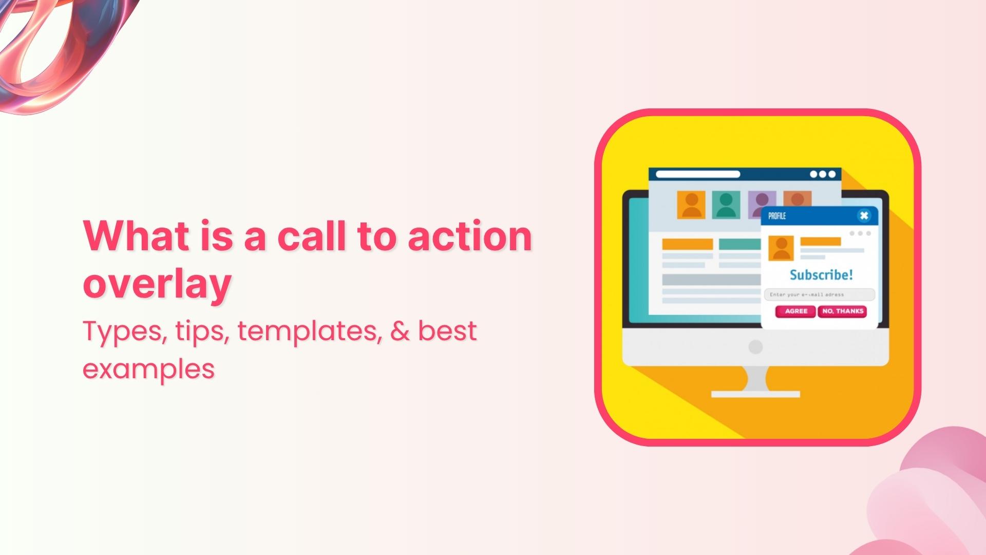
Also read: Call-to-action overlays: Types, tips & templates [+ examples]
Now that we’ve doubled down on why the color of your call-to-action button matters and how to customize it using Replug, we’ve handpicked some of the best CTA button color examples for you. These real-world examples will give you a visual understanding of how different colors guide user perception, and how smart brands use them to drive clicks, signups, and sales.
Ready to pick your favorite?
Scroll down and see which CTA makes you want to click!
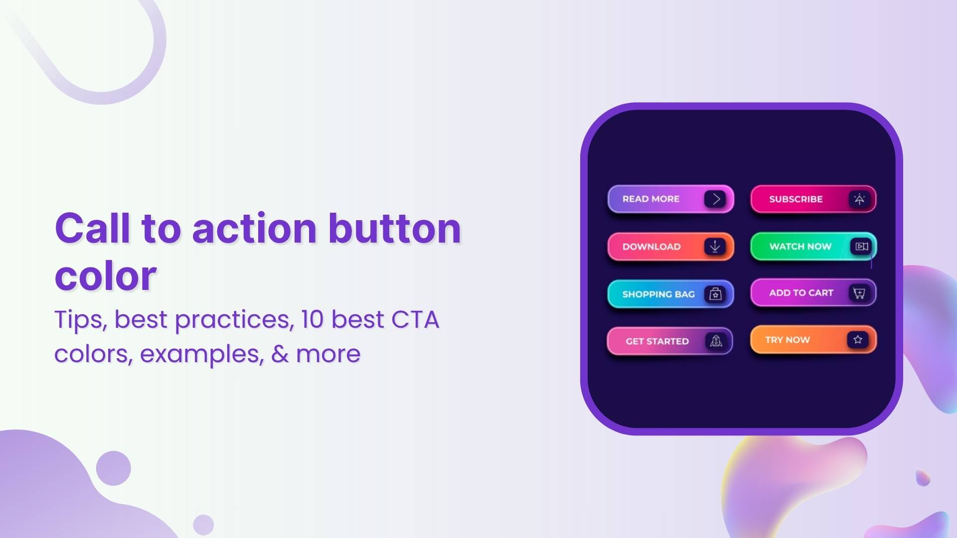
10 best call to action button colors (and when to use them)
So, what is the best call to action button color?
Marketers, designers, and honestly, entire Slack channels have debated this endlessly. But the answer isn’t as simple as “red always wins” or “blue builds trust.”
Let’s break it down, color by color, with what psychology and research actually tell us:

1. Red: urgency, excitement
Red is bold, loud, and great when you need to shout. It sparks urgency, perfect for flash sales, limited-time offers, or “Get Started” buttons. Also, red has been shown to increase heart rate.
- When to use: Short-term offers, countdowns, or high-energy campaigns where you want quick clicks.
- When to skip: If your brand is about calm, trust, or luxury, red might feel too aggressive or stressful.
Examples:
- Coca-Cola: Shop Collection — red evokes excitement and brand passion.
- Netflix: Get Started — red hints at bold entertainment and immediacy.


2. Green: comfort, progress, and go-ahead vibes
Green is reassuring. It whispers “Go ahead, it’s safe,” which is why it’s often used on checkout buttons or anything health-related. It’s tied to nature, wellness, and even prosperity.
- When to use: Moments where you want users to feel comfortable and reassured as they take the next step.
- When to skip: If your site already has a lot of green, your button might fade into the background.
Examples:
- Postnitro: Start creating free carousels — calm encouragement to begin.
- Evernote: Get Evernote free — signals progress with a peaceful touch.


Also read: 100+ call-to-action phrases you NEED to use [+ best examples]
3. Blue: trust, calm, and professional polish
Blue is a crowd favorite. 57% of men and 35% of women rank it as their top color. It feels secure, stable, and reliable, which is why banks, SaaS tools, and corporate sites love it.
- When to use: Professional services, information-heavy sites, or brands built on credibility.
- When to skip: In food-related spaces (blue can suppress appetite) or when you want a more emotional, warm vibe.
Examples:
- Replug: Get your short link for free — stable, reliable call to action.
- ContentStudio: Start your free trial — builds user confidence.


Create compelling Call-to-Actions to boost conversions
Improve your click through rate by creating catchy CTAs for your marketing campaigns.
Get Started For Free!
4. Orange: friendly, fun, and attention-grabbing
Orange is energetic and playful, combining red’s urgency with yellow’s cheerfulness. However, about 29% of people rank orange as their least favorite color. It can feel cheap or off-brand in serious contexts.
- When to use: Playful brands or when you want fast engagement without feeling too aggressive.
- When to skip: Luxury products or serious industries where a more premium feel is needed.
Examples:
- HubSpot: Get a demo — warm and inviting for curious prospects.
- The Budgetnista: Take the 60 sec quiz — quick and casual engagement.


Also read: Call to action for social media: 15 best examples
5. Yellow: Bright, optimistic, and grabs attention
Yellow pops off the page and brings a sunny, cheerful energy. It’s hard to miss, which is great for catching eyes. But too much yellow can feel overwhelming or even cautionary, like a warning sign.
- When to use: Secondary actions, highlights, or to draw attention to updates and offers.
- When to skip: As your main CTA color. It can strain the eyes or create tension if overused.
Examples:
- charity: water: Join now — optimistic urgency for a cause.
- Mailchimp: Start preview — energetic but not overwhelming.


6. Pink: playful, creative, and niche
Pink feels fresh and youthful. It’s a favorite in beauty, lifestyle, and creative spaces.
- When to use: Visuals and brands that embrace creativity, femininity, or trendiness.
- When to skip: More minimalist, corporate, or gender-neutral designs where pink might feel out of place.
Examples:
- Barbie: Join #BarbieWatchParty on X — playful and on-brand.
- Wool and the Gang: SHOP NOW — stylish with a soft edge.


7. Purple: luxury, creativity, and prestige
Historically tied to royalty, purple has always carried an air of exclusivity. It’s also linked to imagination and sophistication.
- When to use: High-end products, boutique brands, or creative spaces.
- When to skip: Mass-market audiences or when you want to appear approachable and mainstream.
Examples:
- Usermaven: Sign up free — smart and slightly premium.
- Discord: Earn Orbs — community and creativity meet.


8. Black: sleek, bold, and modern minimalism
Black buttons look powerful and stylish, especially for fashion, luxury, or tech brands. About 28% of famous companies use black as their brand colors for a cutting-edge feel.
- When to use: Premium product lines, minimalist designs, or when you want to add weight to your button.
- When to skip: Friendly, casual brands or spaces where black might come off as too harsh or impersonal.
Examples:
- Contentpen: Start with 3 free articles — sharp and direct.
- Typeform: Get Started — it’s free — stylish and professional.


9. Grey: neutral, calm, and understated
Grey doesn’t compete for attention, making it ideal for secondary actions. It’s balanced and professional but easily blends into the background if not used carefully.
- When to use: Supporting buttons, disclaimers, or actions that don’t need the spotlight.
- When to skip: As your main CTA color, it can feel dull or signal a disabled state.
Examples:
- Canva: Read more — clear, but not dominant.
- Etsy: Shop these unique finds — blends into a creative backdrop.


10. White: pure, simple, and clean
White lets other design elements shine. It creates a sense of space and minimalism when used well. But too much white can create visibility issues, especially with low-contrast backgrounds.
- When to use: High-end, airy layouts or when your background is dark and you need something that pops.
- When to skip: White-on-white designs or when the overall feel risks being too sterile or lifeless.
Examples:
- M&M’s: Personalize your M&M’S — lets color pop on the page.
- Apple: Watch the clip — sleek, distraction-free experience.


Quick recap
- Warm colors like red, orange, and yellow can create urgency and excitement.
- Cool colors like blue, green, and black often build trust or feel premium.
- There’s no single “best color,” only the best choice for your brand, audience, and context.
What experts say about CTA button colors and conversion optimization
If you search online for the “best call to action button color”, you’ll quickly find lots of strong opinions, and sometimes, conflicting advice. Some marketers swear by red for urgency. Others love green for its calm and positive feel. And plenty argue that blue builds the most trust.
So, who’s right?
Experts often fall into three camps when it comes to conversion optimization:

- The generalizers: They share broad best practices, like “warm colors grab attention” or “contrast your button against the background.” These tips help, but they don’t always explain why certain colors resonate more with specific audiences.
- The pigeonholers: They believe there’s a secret formula, a single “winning” color that always boosts conversions. But, what works for one brand or campaign might not work for another.
- The perpetual testers: They focus on experimenting over and over. For them, there’s no one-size-fits-all answer. The real key is trying different button colors, tracking what drives clicks, and refining based on results.
The truth is, your call to action button color does matter, but context is everything. Replug users often run A/B tests on their landing pages to see which one performs best – and call to action button colour can be a potential variable as to why only one landing page is worth keeping.
For instance, some audiences might click more on a bold orange “Learn More” button, while another responds better to a calm blue “Get Started.” This testing-first mindset is what often helps brands increase CTR and see the real impact of color on your conversion rates.
There isn’t a single color that works perfectly for every product or audience. Instead, it’s about choosing a color that fits your brand, contrasts well with your design, and feels right to your target users.
Wrapping it up
The right CTA button color can catch the eye, stir emotion, and even nudge someone to click.
But there’s no one-size-fits-all formula.
Your brand, audience, and goals should guide your palette. Want trust? Try blue. Need urgency? Red might do the trick. Going for luxury? Maybe black.
So, test, tweak, and trust your data. And don’t be afraid to break the “rules” if it works for your people.
Because at the end of the day, it’s not just about color psychology; it’s about connection.
Create compelling Call-to-Actions to boost conversions
Improve your click through rate by creating catchy CTAs for your marketing campaigns.
Get Started For Free!
FAQs for call-to-action button color
What is the color palette for CTA buttons?
There’s no fixed palette, but popular CTA button colors include red (urgency), green (go), blue (trust), orange (excitement), and black (luxury). The best color depends on your brand vibe and what action you want people to take.
What is a good color for a button?
A good button color stands out from your background and matches your message. Red and orange work well for urgent actions, while green and blue feel more calm and trustworthy.
What color attracts people to click?
Red and orange tend to drive the highest click-through rates in many tests. But ultimately, the most “clickable” color is one that contrasts well and aligns with user expectations on your site or campaign.
What is call-to-action button color psychology?
CTA button color psychology is the study of how different colors influence people’s decisions to click. For example, red can create urgency, blue builds trust, and green signals success. Choosing the right color can improve conversions—when done with context in mind.