


Sharing useful content is part of every marketer’s daily routine; whether it’s an insightful article, a trending video, or a how-to guide your audience will love, But what if, instead of stopping there, you could guide your audience toward the next step you want them to take; right on top of the content you share? That’s where call-to-action overlays come in.
Create compelling Call-to-Actions to boost conversions
Improve your click through rate by creating catchy CTAs for your marketing campaigns.
Get Started For Free!
In this blog, we’ll explore what CTA overlays are, how they work, why they’re powerful, real examples, templates, best practices, and how tools like Replug make creating call-to-action overlays simple, even if you don’t code.
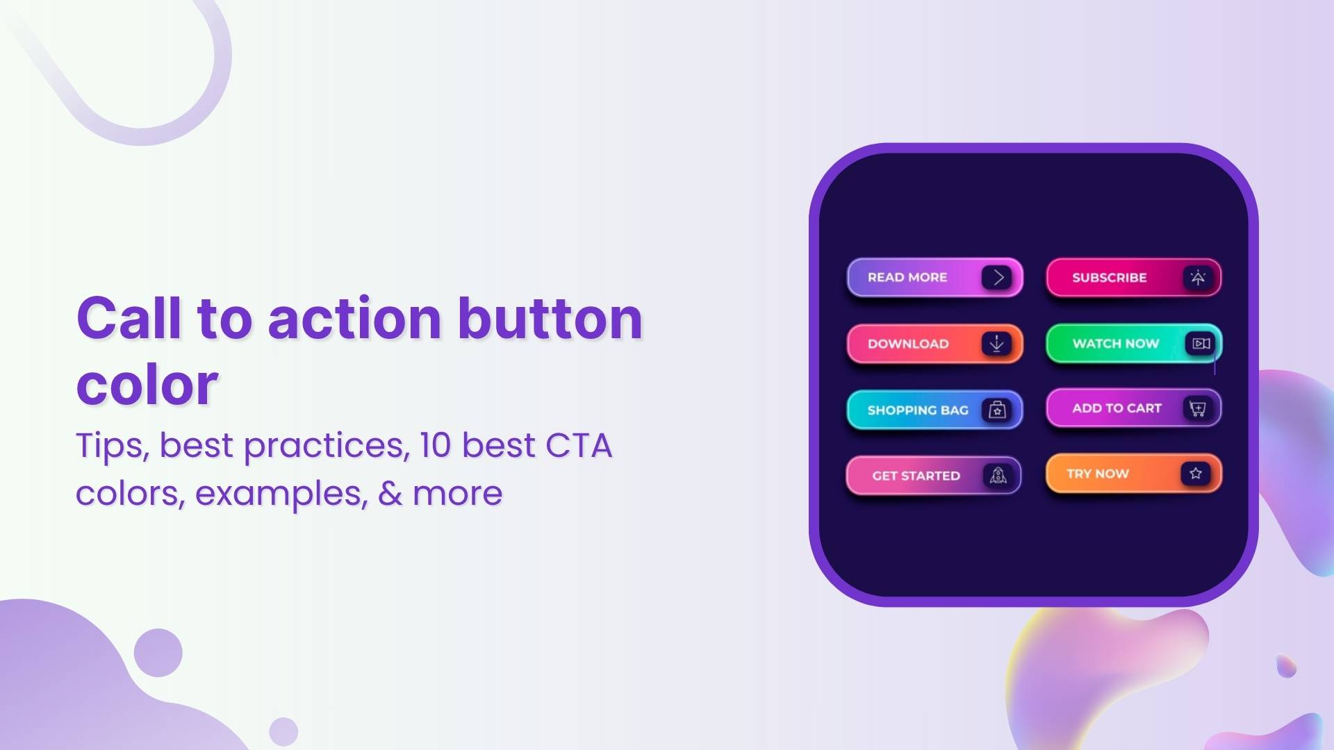
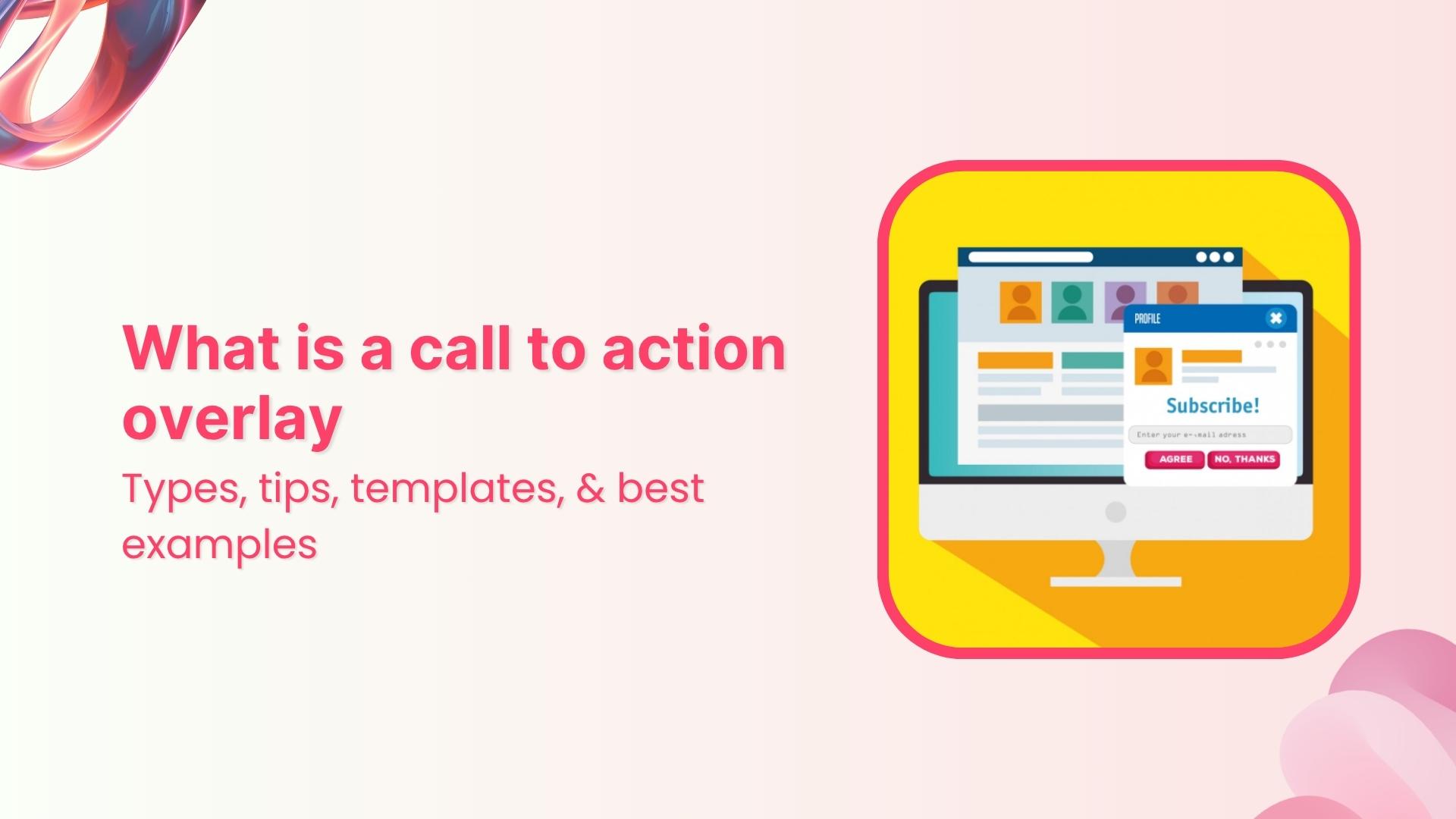
What are call-to-action overlays?
A call-to-action overlay is a small, non-intrusive, and interactive pop up or banner (like a CTA banner or CTA button) that appears over content.
These overlays act as interactive prompts, encouraging users to:
- Click a CTA button to visit your landing page
- Subscribe to your newsletter
- Download a resource
- Follow your social channels
Why use CTA overlays?
Adding call-to-action overlays to content helps:
- Increase traffic to your website or landing page
- Build email lists faster
- Promote offers, webinars, or digital products
- Maximize conversions on your offers or promotions
- Keep your brand visible even when sharing third-party content
For example, if you share an article about marketing trends, your CTA banner could invite readers to download your free eBook on the same topic.
With tools like Replug, you can add CTA overlays in minutes, turning every shared link into an opportunity to capture leads.
How do call-to-action overlays work?
You start by selecting a call-to-action generator like Replug; a tool that not only lets you add customizable call-to-action banners and pop-ups but also tracks clicks to see what’s working best.
Next, you:
- Pick the content you want to share. It can be anything; an article, video, or guide that your audience will find useful and engaging.
- Design your overlay. This could be a button, banner, or form featuring a short message and a clear call to action, like “Subscribe now” or “Get the free guide.”
Replug makes it easy to brand these overlays with your logo, colors, and style, so every shared link becomes a subtle marketing asset that drives traffic back to your website or landing page.
How to create call-to-action overlays with Replug
Adding CTA overlays with Replug is quick and doesn’t need any coding. Here’s how:
Step 1: Log in to Replug or sign up for a 14-day trial with access to full features.
Step 2: Create a new CTA from the campaign section
Step 3: In the “Call-to-action” tab, select your button style (or call-to-action overlay).
Step 4: Click “Next”. Type in a catchy headline, message, button text, and link URL (or phone number) for your CTA campaign.
Step 5: Customize the look. Pick a colour palette or adjust it yourself by changing the background, text colour, and tweaking the appearance.
In just a few minutes, you’ll have a branded pop up, exit intent, banner, or social classic/modern CTA button ready to add to any shared link, helping you drive traffic to your landing page, collect leads, or promote special offers.
Create compelling Call-to-Actions to boost conversions
Improve your click through rate by creating catchy CTAs for your marketing campaigns.
Get Started For Free!
Types of call-to-action overlays
Replug offers multiple types of call-to-action overlays so you can match your message with your marketing goal. Here’s a quick look:
| Overlay type | What it looks like | Perfect for |
| Pop up | Large overlay in the center of the screen | Grabbing attention, collecting emails, limited-time offers |
| Banner | Long strip at the top or bottom of the page | Sharing announcements, driving traffic to a landing page, subtle promotions |
| Scroll box | Appears when a visitor scrolls a set percentage down the page | Engaging already-interested users, mid-article offers |
| Exit intent | Shows up when someone is about to leave the page | Saving abandoned visitors, last-chance discounts, newsletter sign-ups |
| Social classic and social modern | Small, always-visible button on the page | Keeping your brand visible, encouraging ongoing engagement, linking to social or special pages |
With Replug, adding these CTA overlays to your shared links is simple. You can turn every pop up, banner, or social classic/modern CTA button into a powerful tool to guide visitors back to your landing page, newsletter, or offer.
Also read: CTA in marketing: What it means and why it matters
Best practices for designing effective CTA overlays
Your call-to-action (CTA) overlay isn’t just a button or banner; it’s the make-or-break moment between a visitor and a conversion. A few thoughtful tweaks can turn a passive visitor into an active user.
Here’s how to get it right:
Keep it clear and actionable
Use verbs that make the next step obvious: “Download your free ebook now,” “Start free trial,” or “Get my exclusive discount.” Avoid vague CTAs like “Click here” or “Learn more,” as they don’t clearly communicate the benefit to the user.
Add your official contact information
Include your business email, phone number, or website so people know the overlay is legitimate and can easily reach you.
Make it stand out but stay on-brand
Your CTA overlay should catch the eye without clashing with your overall design. Use contrasting colors that draw attention, while still fitting within your brand palette. Rounded corners and subtle shadows can also make buttons feel more inviting and clickable.
Also read: Top call-to-action tools – Proven CTA tips and tricks
Size and placement matter
A call-to-action overlay should be large enough to notice, but not so large it feels overwhelming. Place it above the fold and repeat it after key sections or at the end of longer pages, so visitors always have an opportunity to take action without scrolling back.
Test different variations
Small changes, like updating text from “Sign up” to “Join free,” or adjusting the button color, can affect conversion rates. Use A/B testing to see which combinations work best for your audience.
Create a sense of trust and urgency
Adding phrases like “Secure checkout,” “Limited offer,” or “Offer ends today” helps encourage faster action and reassures users about the safety of their information.
Keep it concise
CTA text should typically stay between two to five words. Short, direct messages have more impact and are easier for users to process quickly.
Tip: If you’re using tools like Replug to add CTA overlays to curated content, apply the same best practices: clear copy, contrasting design, and strategic placement. This will guide users toward your goal effectively.
Examples of call-to-action overlays
Here are some examples of the different types of call-to-action overlays:
1. Replug
– Top banner CTA overlay

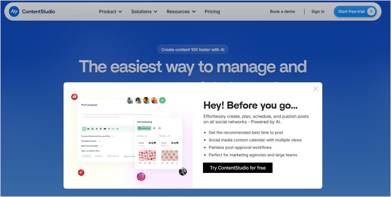
2. ContentStudio
– Exit intent CTA overlay
3. Usermaven
– Popup CTA overlay
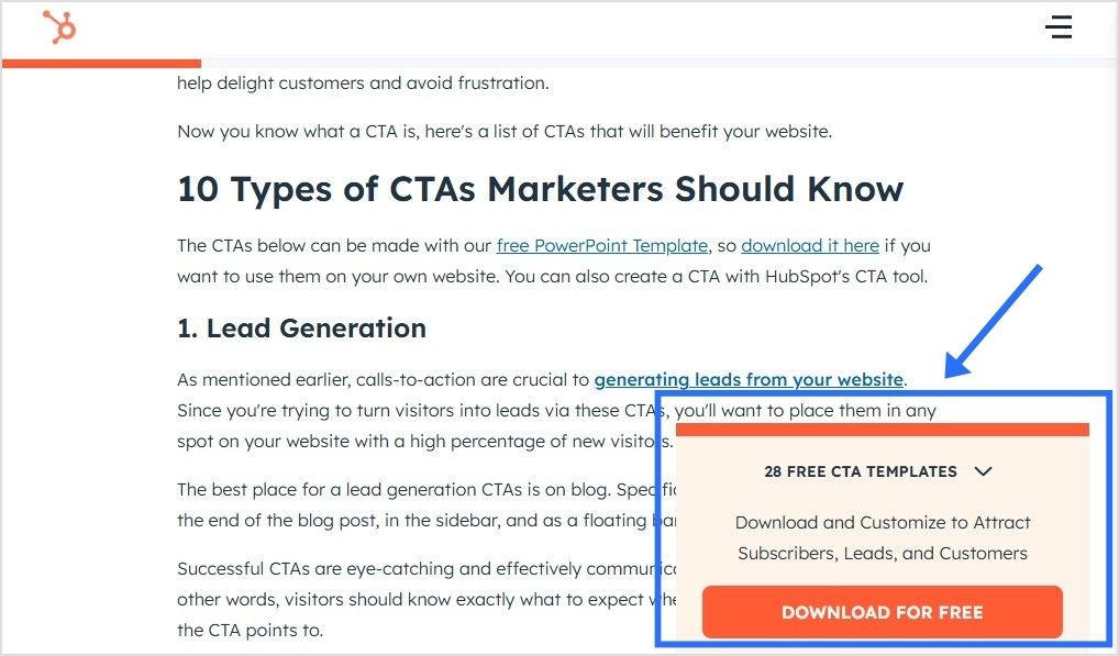
4. HubSpot
– Social classic/modern CTA overlay
5. Adobe
– Top banner CTA overlay

6. GirlBoss Daily
– Scroll Box CTA overlay

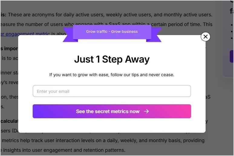
7. Backlink.io
– Popup CTA overlay

8. TechCrunch
– Top banner CTA overlay

9. Minimalist Baker
– Popup CTA overlay

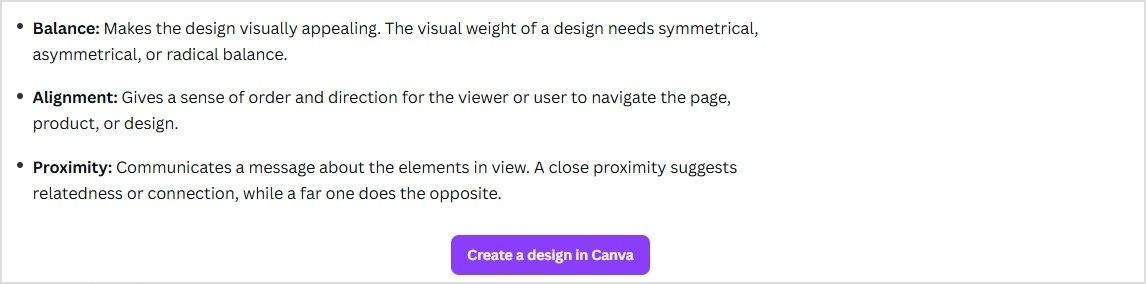
10. Canva
– Bottom banner CTA overlay
CTA overlay templates you can copy and paste
Need a little spark to write your overlays? Here are real-life inspired CTA overlay templates or CTA button templates you can copy, tweak, and make your own. From popups to banners and scroll boxes, these aren’t your typical “click here” buttons; they’re punchy, playful, and crafted to get real clicks.
| Scenario | Overlay type | Template (headline + message + CTA button) |
| Sharing a trending industry article | Popup | Headline: “Get our free 2025 social media checklist!”Message: “Stay ahead of trends with proven tips.”CTA button: “Show me the secrets” |
| Sharing a product review blog | Banner | Headline: “Limited-time offer!”Message: “Use code SAVE10 for 10% off your first purchase.”CTA button: “Yes, I want the deal” |
| Sharing a whitepaper or report | Banner | Headline: “Need expert advice?”Message: “Book a free consultation to grow your business.”CTA button: “Let’s make a plan” |
| Sharing a YouTube video | Social modern | Button text: “Send me fresh tips” |
| Sharing a lifestyle blog | Exit intent | Headline: “Wait! Don’t miss this deal.”Message: “Sign up now and get 10% off your first order.”CTA button: “Unlock my discount” |
| Sharing a blog on productivity hacks | Scroll box | Headline: “Want to work smarter?”Message: “Book your free strategy call today.”CTA button: “Yes, boost my workflow” |
Also read: 100+ call-to-action phrases you NEED to use [+ best examples]
Conclusion
Call-to-action overlays transform every piece of shared content into a conversion tool.
Whether you’re driving traffic to your landing page, collecting emails, or promoting offers, CTA overlays keep your brand in the spotlight, even on third-party content.
Tools like Replug make adding CTA banners, popups, and buttons effortless, helping you capture more leads without extra effort.
Start turning your shared links into results today!
FAQs on call-to-action overlays
What are call-to-action overlays?
They’re small popups or banners that appear over content, prompting users to take action (e.g., click, subscribe, visit a landing page).
Why don’t CTA overlays work on every website?
Some websites like Facebook, LinkedIn, or most Google pages, use iframe restrictions to protect their content. This means they don’t allow their pages to be displayed inside another page. When this happens, tools like Replug offer an option to create a summary page. Instead of showing the original site directly, your audience sees a branded page summarizing the content, along with your CTA overlay.
Can I customize the design of my call-to-action overlay?
Yes! With tools like Replug, you can change text, colors, and CTA button styles to match your brand.
What is the best practice for CTA placement?
Place CTAs where they naturally fit into the user journey: above the fold, at the end of content, or triggered by user behavior (like scrolling or exit intent). With call-to-action overlays, you can place them to appear as popups, banners, or scroll boxes, so they stay visible without being disruptive.
Are call-to-action overlays compatible with all content?
In most cases, yes! Call to action overlays are compatible with blog posts, articles, YouTube videos, product pages, and landing pages. Some sites may block iframe-based overlays, but you can counter this by creating a bridge page using Replug.
What is an example of a call to action?
A simple example: “Subscribe to get our free weekly tips.”
As a call-to-action overlay, this might appear as a banner over an article you share, or as an exit intent popup inviting visitors to sign up, keeping your message front and center even when sharing external content.
Is a CTA always a button?
Not always! While CTAs often appear as buttons because they’re clear and clickable, they can also be banners, text links, floating widgets, or popups, especially when used as call-to-action overlays on shared content.
What’s the difference between a CTA banner and a popup?
A banner stays at the top or bottom of the page, while a popup appears in the center or corner, often for email capture.