Landing pages work like helipads; they provide a space for visitors to land and allow brands and marketers to drive them in the right direction – that’s an analogy.
By definition, a landing page is a sales or offer page that is designed to engage, attract, or convert a lead into a subscriber or paying customer.
Marketers, bloggers, and SEOs do a lot of testing when they’re running campaigns, promoting offers, and developing new content clusters.
One of the many testing experiments is about landing pages. Let’s explore what it is and how any brand, digital marketer, or agency can benefit from it.
What is landing page testing?
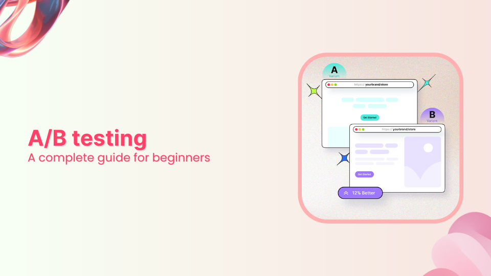
Landing page testing is an A/B testing of two versions of a landing page where the variables, such as design, copy, color scheme, and CTA, are in action and the purpose of landing page testing is to figure out which variant performs better.
Brands, marketers, and agencies A/B test landing pages when they’re running a marketing campaign and want to see which version of the landing page outsmarts the other one.
After the testing is completed, it becomes crystal clear which landing page performs better than the other one. The follow-up process is to deeply analyze the key elements of the winner landing page to elicit its secret sauce and repeat the same results going forward.
On the other hand, it’s also important to closely look at the losing version of the landing page to see what went wrong with it.
Types of landing page testing
Landing page testing is crucial to identifying the flaws and pinpointing the winning elements by putting the landing pages to the test. Generally, marketers and conversion optimization experts use two types of landing page testing methods for testing and improving landing and sales pages. Let’s discuss those:
A/B testing
A/B testing is the widely used landing page testing method that compares two versions of a landing page. These landing page versions contain some differences that signify the purpose of the testing. This testing method helps in determining what elements trigger specific user behaviors and actions. It is an excellent process to refine the landing page and make it more effective with subtle improvements.
Multivariate testing
Multivariate testing (MVT) goes one step further by keeping the true essence of A/B testing intact. It puts more variables to the test as compared to A/B testing. However, it’s vital to comprehend multivariate testing requires a high volume of website traffic to lay the groundwork for the testing. Moreover, this type of landing page testing includes analysis of several elements, such as headlines, copy, images, colors, and more. It somehow speeds up the testing process and helps marketers and brands find the right combination of elements within a short period.
Split URL testing
Split testing is a technique used to compare two different versions of a webpage, product, or service to figure out which version is more effective in achieving a specific goal or objective. In other words, the user splits the traffic between the two or more landing page variants to see which one works best. The key difference between A/B testing and split testing is that in split testing the user equally divides the traffic between both versions. Replug has an A/B testing option for testing the URL, which allows users to split-test the URLs.
Link Management Made Easy
Your go to link management tool for CTAs, branded and bio links, QR Codes, tracking and retargeting.
Get Started for FREE!
Why test a landing page?
There have to be a bunch of solid reasons for testing a landing page. No wonder top brands test their landing pages, sales pages, and thank you pages all the time. So, let’s dig in and try to understand why the landing page testing is important. Here’s why you should test a landing page:
i. Understand user behavior
User behavior is an important engagement metric in digital marketing. It refers to the actions that take place after they land on the website page no matter the traffic source.
One of the reasons one must be testing a landing page is to understand how visitors are behaving on the page. When the collective user behavior is rather unresponsive, it depicts an issue with the landing page.
ii. Conversion optimization
Conversion optimization is a process of fine-tuning the sales funnel so that it gets easier for prospects to convert into paying customers. Brands optimize their websites, landing pages, social media ads, CTAs, and opt-in forms to improve conversion rates.
Undoubtedly, one of the reasons a marketer or brand might have in mind when testing a landing page is that they would want to optimize the conversion on the landing page. Conversion optimization leads to more sales and profitability.
iii. Increase clickability
Clicks on the CTAs, links, banners, and ads are crucial to any digital marketing campaign regardless of the niche. Since landing pages an essential for marketing real estate, it’s vital to keep track of their clickability.
When testing a landing page using different parameters, make sure to add clickability tracking to it. A lot of marketers use heat map tools to track the clickability on the landing pages. So, one of the reasons to test and optimize a landing page is to increase clickability without breaking the bank.
iv. Analyze landing page copy
Digital marketers keep track of every marketing strategy they apply to compare the outcomes of each strategy. It helps them make informed decisions to meet their marketing goals.
One of the key elements of a marketing strategy is to pay close attention to the website or landing page copy. It has to be compelling, creative, and catchy to attract, engage, and convert the audience.
Therefore, a common reason why marketers and conversion optimization geeks test a landing page is to make sure that they improve their landing page copy.
v. Entice users to take action
Pushing the visitors by force to take a certain action is almost impossible. You must entice the audience with your attractive offer, creative graphics, catchy UI/UX, and compelling copy to take action. This action could be a download, purchase, subscription, lead generation, form submission, etc.
A lot of marketers do split testing with their landing pages because they want to come up with the best one that outperforms every other landing page.
These are some of the points that tell the importance of testing a landing space and uncovering a roadmap for digital marketers to follow and make a difference.
What are the key elements to test a landing page?
There are numerous elements on a landing page that collectively and individually play a role in making a landing page work. An effective landing page testing may require making several changes and noticing the difference.
Here are some of the key elements of testing a landing page:
i. Layout design
The landing page layout design speaks a lot about the offer behind the wall. Most visitors easily engage with the landing page offer when they find the layout and webpage design appealing and catchy. Not only does an excellent landing page design increase the time spent on the site, but it also decreases the bounce rate.
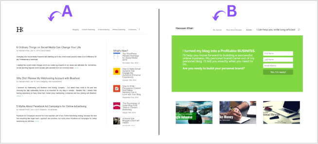
When testing a landing page, make sure to test the layout designs so that the user behavior and overall conversion rate are thoroughly tested. Also, note down the characteristics of the winner layout design to apply them in future landing pages.
ii. Call-to-actions
Call-to-actions are crucial to enticing visitors to take action on the landing page offer. The right wording, color, and button size could make a lot of difference no matter what. Undoubtedly, it’s an essential element when testing the effectiveness, quality, and outcome of the landing page.
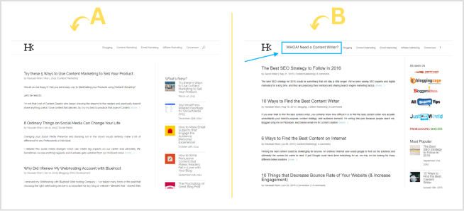
Marketers and brands spend time, energy, and money on paid ads, influencer marketing, and sponsored content to drive traffic to their offers. A tiny mistake of putting up a less effective CTA button could spoil the whole campaign.
iii. Landing page copy
The website or landing page copy is a vital element when testing the conversion, engagement, and CTR. It’s the part of the landing page that translates the offer for the visitors. The wording must be powerful yet simple to send a clear message over.
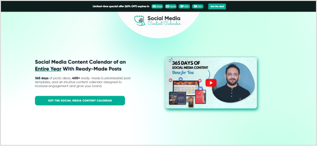
A hefty, cluttered, and jam-packed copy isn’t going to cut it. Marketers and brands should ensure that their landing page copy is clear, concise, and consistent. It shouldn’t put readers off and make them go away. Instead, it must keep them engaged until they’re convinced to take action.
iv. Color scheme
The color scheme on the websites makes a huge difference in the conversion rate, engagement rate, and bounce rate. The reason is that the right color combination hits the bullseye when targeting the audience. Brands often test colors for CTAs, banners, and website navigation to see which works best for them.
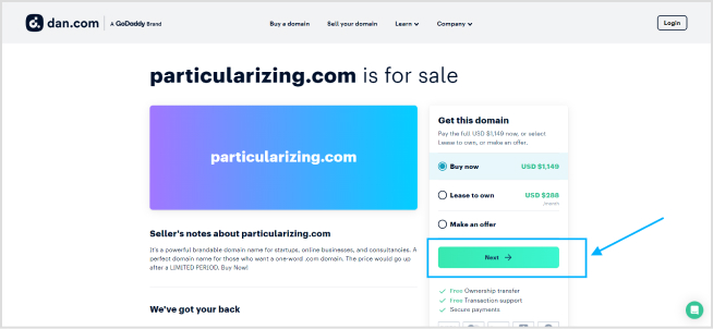
Try to understand your demographics before deciding the colors for your landing page. Moreover, experiment with color schemes when testing your landing pages. The psychology of colors isn’t just a bookish phenomenon; it does work in the branding and digital marketing areas.
v. Social proof
Social proof is yet another essential element that has become inevitable in modern-day digital marketing. Marketers and brands use social proof as testimonials for their products or services.
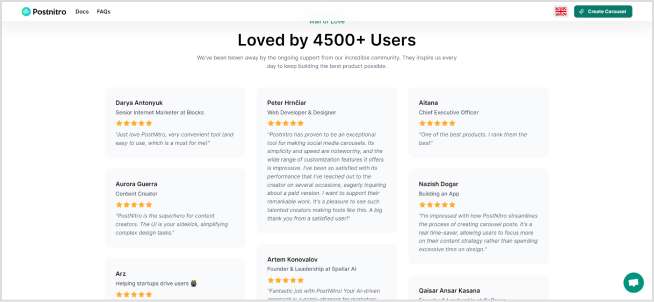
Since social proof brings validation to the offer, it gets easier for the audience to make a purchase decision. No wonder it can be an important element when testing landing pages.
These are some of the key elements to remember when testing your landing page.
Tips to do landing page testing the right way
Landing page testing has never been this easy. Once you know the fundamentals of analyzing the landing page, you can successfully test the performance of two or more landing pages. Here are some tips on landing page testing:
i. Set a clear objective of the campaign
The landing page testing doesn’t go well if you have a vague plan. It’ll be wise to set a clear objective for the campaign, meaning you must be crystal clear with your testing. You should be aware of the differences between the two versions, the key elements of both landing pages, and other minor details. So, vividly set the objective of the landing page testing activity.
ii. Test different CTAs to find the best ones
Call-to-actions (CTAs) are a key element of any landing page or website. The reason is that these buttons initiate engagement and navigate users to money pages or sales funnel to complete the action. Similarly, the size, colors, and text on the call-to-action buttons play a vital role in the performance of the CTA.
iii. Make landing pages mobile-friendly
Crafting a perfect landing page layout and putting the work into writing a splendid copy may not be enough unless you make the landing page mobile-friendly. It’s important to understand the fact that a lot of users access websites, social media, and emails on smartphones and tablets. Therefore, it’s necessary to keep our websites, blogs, and landing pages mobile-friendly.
iv. Add visuals or videos to see the difference
We can’t stress enough that media content works like a charm on the landing pages. Add beautifully designed images, icons, videos, and animations where necessary. Marketers and conversion optimization experts can experiment with images/video landing pages versus no-media version landing pages. The split testing will help you determine which version of the landing page does well.
v. Experiment with colors on the landing page
Colors are undoubtedly an important element of a website or landing page. One of the tips anyone can follow on testing the landing pages is to try out different color combinations on the landing page versions and see which color combo fascinates the users. Users can also try out different color schemes for navigation, CTAs, backgrounds, headers, footers, etc.
So, these are some of the useful tips for testing the landing pages for brands, marketers, and conversion optimization experts.
Replug: Link management solution
Link Management Made Easy
Your go to link management tool for CTAs, branded and bio links, QR Codes, tracking and retargeting.
Get Started for FREE!
Replug is a powerful link management solution that offers various URL management tools and provides a complete toolkit for shortening and tracking URLs.
It’s a handy URL management tool for digital marketers, bloggers, social media influencers, and affiliate marketers who want to shorten URLs, share links on social media and emails, and track their links.
Top Replug features include:
⦁ Bio link
⦁ QR code
Replug is an all-in-one link management suite to create, manage, and track short URLs and elevate a brand’s social media engagement to the next level. Moreover, this tool integrates with several social media, email marketing, retargeting, and lead-gen tools. Plus, it has a Chrome extension for managing the short links without logging in to your Replug account.
The Replug Basic plan costs $19 per month and the Professional plan costs $49 per month. While the Agency plan is priced at $79 per month. If you’re ready to test Replug, then start your 14-day free trial!
FAQs
What is landing page testing?
Landing page testing involves experimenting with different elements of a webpage to determine which version performs better in terms of achieving a specific goal, such as increasing conversions or engagement.
How to test landing pages?
You can test landing pages by using A/B testing or multivariate testing methods. A/B testing involves comparing two different versions of a page, while multivariate testing involves testing multiple variations of multiple elements simultaneously.
A/B testing vs. multivariate testing: What’s the difference?
A/B testing compares two different versions of a webpage, typically differing in one variable, to see which performs better. Multivariate testing involves testing multiple variations of multiple elements on a webpage to determine the best combination.
What are common landing page testing mistakes?
Common mistakes include not testing enough variations, ignoring statistical significance, and making changes based on personal preference rather than data.
How long to run a landing page test?
The duration of a landing page test depends on factors such as traffic volume and the desired level of statistical significance. Generally, it’s recommended to run tests for at least one to two weeks to capture different audience behaviors.


