Ever wondered why some calls to action make you want to click without a second thought? That’s the magic of a well-crafted call to action – it feels like it’s speaking right to you, not at you. You want something catchy, inviting, and, most importantly, something that gets people to click!
But where do you start?
A great CTA isn’t just about “Sign up” or “Buy now”; it’s about finding the words that connect with your audience and make them want to take that next step. Whether you’re trying to boost sales, build your email list, or just get people to check out your latest content, the right CTA can do wonders.
In this post, we’ll walk through some of the best CTA phrases that’ll help you engage your audience in a way that feels natural and, most importantly, gets results.
Sound good? Let’s get calling!
100+ best call-to-action phrases
A call to action is used in all marketing funnels of the customer journey. We’ve categorized the types of call-to-action phrases into 10 types:
- Sign-up/join/community building
- Purchase/checkout
- Booking/scheduling
- Download resources
- Free trials/special offers
- Learn/explore/discover
- Watch/read/engage with content
- User-benefit
- Personalized/custom recommendations
- Urgency-based
Below are 100+ best call-to-action phrases (based on categories) that you can’t afford to miss if you want your campaign to be a hit:
1. Sign-up/join/community building
CTAs that encourage joining a platform, signing up for a service, or subscribing:
- Sign up for our newsletter
- Sign up to [service offering]
- Create an account
- Sign in to access
- Join now
- Sign in
- Subscribe to join the community
- Join [platform name]!
- Make your inbox (and life) happier—sign up!
- Let’s grow together—start today.
- Become a part of our community
- Be the first one to know about new updates and offers
- Ready to join?
- Subscribe to unlock deals
- Join 10,000+ happy users today!
- Become part of the [platform name] family.
- Your tribe is waiting—join now.
2. Purchase/checkout
CTAs that drive immediate purchases or encourage adding items to the cart:
- Buy now
- Add to cart
- Add to bag
- Complete your purchase
- Treat yourself—you deserve it.
- Order now
- Shop deals
- Shop gifts
- Grab one today and boost your [user benefit].
- Shop now
- Checkout
- Add one more item to get free shipping
- Treat yourself today
- Make it yours in just one click.
3. Booking/scheduling
CTAs that promote booking appointments or demos:
- Book an appointment
- Book a call
- Book a demo
- Talk to an expert
- Your calendar is calling.
- Pick the perfect time for you.
- Set your plan in motion today.
- Request a demo
- Reserve your spot today!
- Your next step starts here—book now.
- Secure your spot before it’s gone.
- Don’t leave your future self waiting—choose a time now.
- Got a minute? Let’s schedule something amazing.
4. Download resources
CTAs focused on offering downloadable materials:
- Download free guide
- Download additional resources
- Download e-book
- Download the pdf to learn more
- Get your copy
- Get your free copy now!
- Get the FREE case study now!
- Access your free resource now.
- Your free download is waiting.
- Get actionable insights with this free resource.
- Equip yourself with the ultimate [guide/tool].
- What’s stopping you? Get your copy today.
- Your freebie is just a click away!
5. Free trials/special offers
CTAs aimed at trying something free or availing offers:
- Start your free trial
- Get started for free
- Only a few left—act fast!
- Try it free for [number of days]
- Kick off your 14-day free trial!
- Get free [product offering]
- Claim my exclusive offer now!
- Your VIP pass awaits—grab it now.
- Redeem my voucher
- Try out for free
- Don’t miss out—get exclusive access today.
6. Learn/explore/discover
CTAs that invite users to explore features, learn about tools, or discover resources:
- Learn about [tool name]
- Explore our [services]
- Discover more
- Discover your tailored recommendations
- Find your nearest store
- See it here
- See what’s new
- Peek inside and be amazed!
- Ever wondered how? See for yourself.
- Take a closer look—you’ll love what you find.
- Find out what everyone’s raving about.
- See for yourself
- Explore features
- Discover the full article
- The wait is over—check it out.
7. Watch/read/engage with content
CTAs designed to promote media or storytelling content:
- Watch the video
- Read story
- Read full story
- Read more
- Check it out
- See it in action
- Get a sneak peek
- Find out how they did it
- See the product for yourself with the seven-day free trial
- Get the lowdown
- See it in action—watch now.
- Your binge-worthy content awaits.
- Dive into the full story now.
- Read the full scoop now.
- Grab a coffee and dig into this.
- It’s storytime—are you ready?
8. User-benefit
CTAs that emphasize immediate user benefits:
- Change your life
- See the difference
- Unlock [user benefit]
- Boost your [user benefit] instantly!
- Your [solution] is just a step away.
- Refer a friend and get $X off
- Say goodbye to [problem]—start now.
- Get tools that work as hard as you do.
9. Personalized/custom recommendations
CTAs that emphasize immediate user benefits:
- Discover your tailored recommendations
- Start your [customer journey]
- Find your [product]
- Pick your favorite
- Find out what everyone’s raving about.
10. Urgency-based
CTAs emphasizing urgency or limited-time offers:
- Don’t miss this limited-time offer.
- Act fast—limited stock available!
- Limited edition, buy now.
- Your VIP pass awaits—grab it now.
- First come, first served—get yours today.
- Only a few left—act fast!
- First come, first served. Get yours today!
- The wait is over. Check it out!
Our top picks for the best call-to-action phrases
Check out our top picks (category-wise) for the best call-to-action phrases that drive engagement and inspire users to take action:
Examples of sign-up/join/community building CTAs
Example #1: Replug – ‘Sign in’ & ‘Try for free’
Source: Replug
Why it works: A no-fuss approach that says, “You’re already part of the family—come on in and pick up where you left off.” or even better, if you’re not a part of the family, it gives new users the option to try the tool for free!
Example #2: Lyft – Apply to drive/Sign up to ride
Source: Lyft
Why it works: Speaks to two audiences at once, making it easy for both hustlers and riders to feel catered to.
Example #3: Sephora – Sign In to Access
Source: Sephora
Why it works: A hint of exclusivity that says, “Unlock the good stuff by signing in—it’s worth it, promise.”
Example #4: Starbucks – Join now
Source: Starbucks
Why it works: Who can resist the promise of a free drink? This CTA combines immediate gratification with the allure of community.
Example #5: Yango – QR Code, Download Yango ‘Open in browser’
Source: Yango
Why it works: This CTA makes downloading a breeze with a QR code and a clear option to open in the browser, making it convenient and accessible for any user.
Examples of purchase/checkout CTAs
Example #1: Walmart – Shop Deals
Source: Walmart
Why it works: Highlights “deals” to grab your attention and tempt your inner bargain hunter—because who doesn’t love a good steal?
Example #2: Huda Beauty – Add to Bag
Source: Huda Beauty
Why it works: Feels natural and inviting, like tossing a must-have item into your shopping bag IRL—effortless and satisfying.
Example #3: Apple – Shop Gifts
Source: Apple
Why it works: Appeals to your thoughtful side, positioning Apple products as the ultimate choice for those special gift-giving moments.
Example #4: Wendy’s – Order Them New Things
Source: Wendy’s
Why it works: Fun and casual, this phrase feels like a friend hyping up something fresh and exciting you need to try.
Example #5: Disney – Get Tickets Now
Source: Disney
Why it works: Simple, urgent, and exciting—this CTA taps into the anticipation of Moana 2 and encourages users to get their tickets for the movie through the website.
Examples of booking/scheduling CTAs
Example #1: ContentStudio – Start your free trial
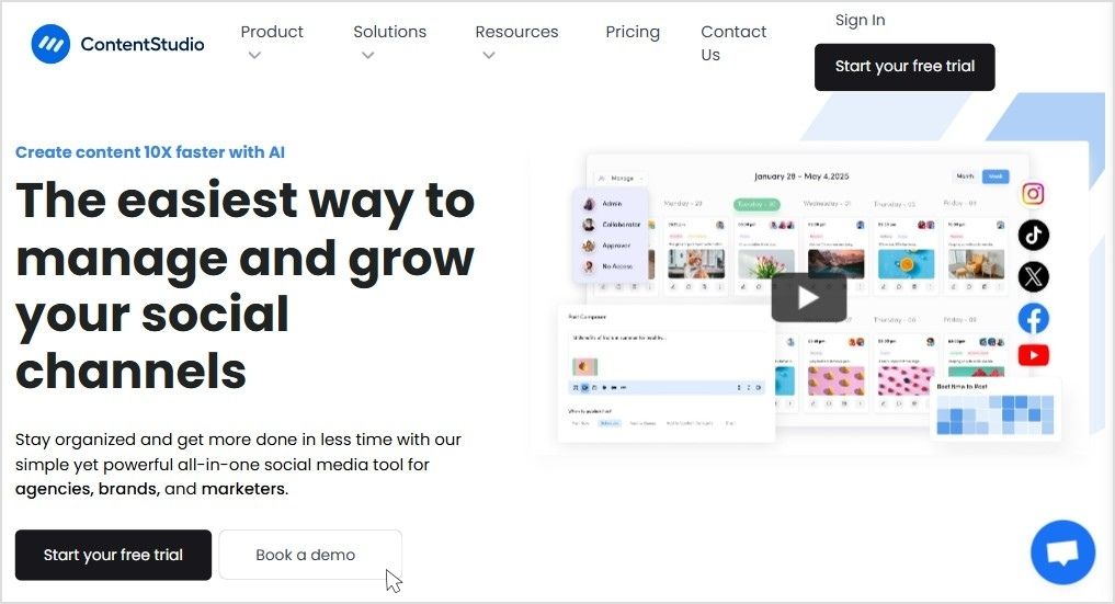
Source: ContentStudio
Why it works: No risk, no pressure—just a friendly trial invitation to explore what could become your new favorite tool.
Example #2: Niel Patel – Book a call
Source: Niel Patel
Why it works: Short and simple, this CTA eliminates barriers and makes reaching out for expert help feel effortless.
Example #3: Tesla – Demo Drive
Source: Tesla
Why it works: Test drive a Tesla? Say no more. This CTA doesn’t sell you; it lets the car do all the talking.
Example #4: Hilton – Book Now and Save
Source: Hilton
Why it works: A classic power duo—booking and saving. It’s like your vacation just got a free bonus round.
Example #5: ClickUp – Book free 1:1 Session
Source: ClickUp
Why it works: Combines personalization with a freebie—two things that make users feel valued and eager to engage.
Example #6: Holded – Talk to Sales
Source: Holded
Why it works: By linking directly to a number, this CTA offers a quick and effortless way to connect, making the sales conversation fast and accessible.
Examples of download resources CTAs
Example #1: Hubspot – Download now: 28 Free CTA Templates
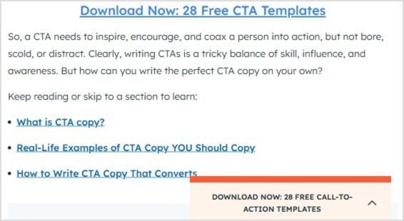
Source: Hubspot
Why it works: The promise of instant, actionable value makes this a no-brainer for marketers looking for quick wins.
Example #2: Oxford University Press – Access the resources
Source: Oxford University Press
Why it works: Straightforward and academic, it appeals to users looking for reliable, high-quality educational content.
Example #3: Klaviyo – Get your copy
Source: Klaviyo
Why it works: Short and conversational, it feels approachable while highlighting the benefit of receiving a helpful resource.
Examples of free trials/special offers CTAs
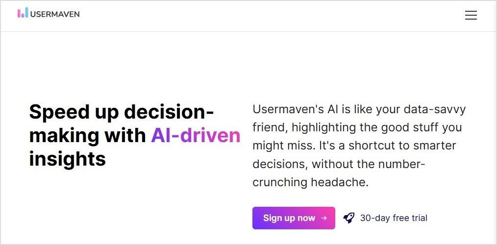
Example #1: Usermaven – 30-day free trial
Source: Usermaven
Why it works: A whole month to try before you buy? This CTA removes hesitation while boosting confidence in the product.
Example #2: Replug – Kick off your 14-day free trial
Source: Replug
Why it works: “Kick off” adds excitement, making the trial feel like the start of something productive and rewarding.
You may also like: How to Create a CTA Campaign Using Replug?
Example #3: Canva – Get Canva Free/Pro trial/Teams trial
Source: Canva
Why it works: Highlights multiple options to suit every need, making it easy for users to find the perfect fit, whether solo or with a team.
Example #4: Hootsuite – Try it free for 30 days
Source: Hootsuite
Why it works: Keeps it straightforward and inviting, making users feel they’ve got nothing to lose by trying it out.
Examples of learn/explore/discover CTAs
Example #1: Dolce and Gabbana – Discover More
Source: Dolce and Gabbana
Why it works: Invites curiosity and adventure, perfectly aligned with the brand’s luxurious and aspirational image.
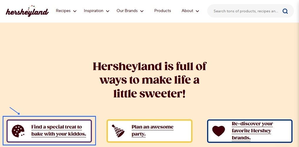
Example #2: Herseyland – Find a special treat to bake with your kiddos
Source: Hersheyland
Why it works: Sweet, nostalgic, and family-centered—this CTA taps into all the warm fuzzies while selling a delicious experience.
Example #3: Zapier – Explore 7,000+ apps
Source: Zapier
Why it works: Highlights the sheer variety, making users feel excited to uncover tools that fit their exact needs.
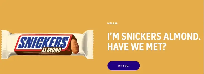
Example #5: Snickers Almond – Let’s go
Source: Snickers
Why it works: Playfully intriguing, it pairs the quirky intro with a confident push to act—fun, engaging, and totally on-brand for Snickers!
Example #5: Asana – Learn about goals
Source: Asana
Why it works: Straightforward and approachable, this CTA says, “Come on in—we’ll make achieving your goals feel simple.”
Examples for watch/read/engage with content CTAs
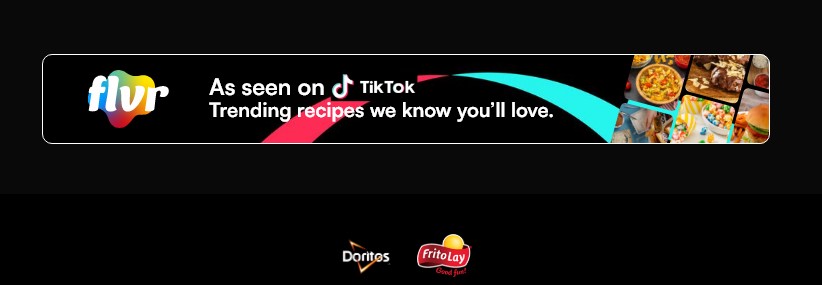
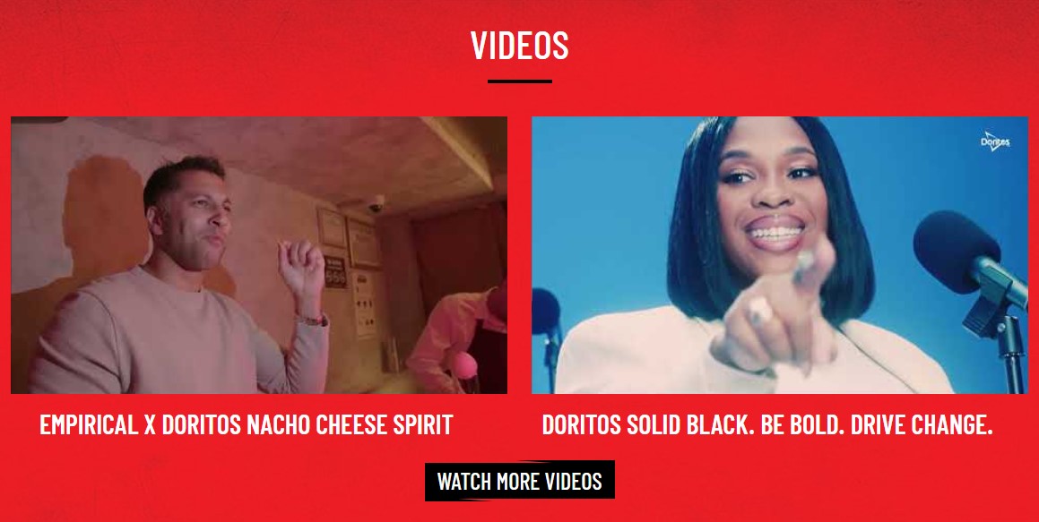
Example #1: Doritos – Watch more videos
Source: Doritos
Why it works: Snack on a video while you snack on chips—this CTA’s casual tone is all about fun and entertainment.
Example #2: Dropbox – Read article
Source: Dropbox
Why it works: Straightforward and practical—perfect for those who want value without fluff or fanfare.
Example #3: Intuit – Read their/her story
Source: Intuit
Why it works: Personal and relatable, this CTA invites you to connect emotionally through real stories.
Example #4: Help Scout – Get a sneak peek
Source: Help Scout
Why it works: Like peeking behind the scenes, this CTA teases exclusivity, making you want to see what’s next.
Example #5: Proctor & Gamble (P&G) – See our iconic brands
Source: Proctor & Gamble
Why it works: Invites users to explore well-known products, showcasing P&G’s history of quality and innovation.
Example #6: NASA – December’s Night Sky (Leads to YouTube video)
Source: NASA
Why it works: Taps into curiosity and the excitement of stargazing, encouraging users to engage with video content.
Example #7: Old Spice – Read the Manbook (leads to the blog page)
Source: Old Spice
Why it works: Playful and on-brand, this CTA invites users to dive into Old Spice’s humorous and bold world, making reading feel like an adventure worth taking.
Examples of user-benefit CTAs
Example #1: Harvard Health Publishing – I want to get healthier
Source: Harvard Health Publishing
Why it works: Personal and goal-oriented, this CTA appeals to users’ desire for self-improvement, motivating them to take action.
Example #2: TOMS – Give 20% off, get 20% off ‘Refer a Friend’
Source: TOMs
Why it works: Highlights a win-win situation, encouraging users to spread the word while earning a discount.
Example #3: Silk + Sonder – Unlock 10% OFF
Source: Silk + Sonder
Why it works: Creates excitement by making users feel like they’re unlocking a special offer just for them.
Example #4: Heumor – Make my website memorable
Source: Heumor
Why it works: Direct and results-focused, this CTA appeals to users looking to improve their online presence.
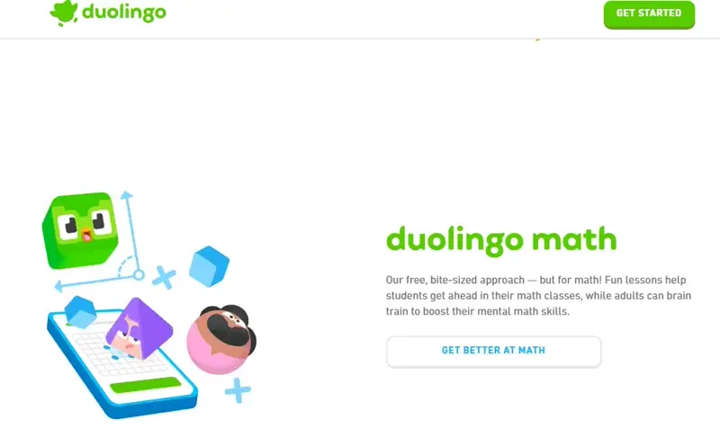
Example #5: Duolingo – Get better at math
Source: Duolingo
Why it works: Appeals to users’ desire for self-improvement and connects the app’s features to real-world benefits.
Examples of personalized/custom CTAs
Example #1: Oreo – Build your OREO Cookie
Source: Oreo
Why it works: Involves users in the creation process, offering an interactive and engaging experience.
Example #2: PostNitro – Start Creating Your Viral Carousel
Source: PostNitro
Why it works: Positions users as innovators, making them feel empowered to create content that can go viral.
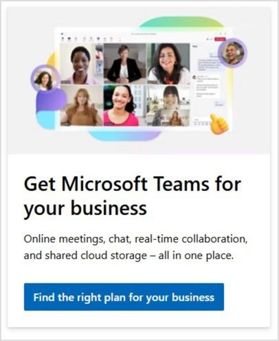
Example #3: Microsoft – Find the right plan for your business
Source: Microsoft
Why it works: Customizes the experience, showing users that their specific business needs will be met.
Example #4: Digital Silk – Calculate your Website
Source: Digital Silk
Why it works: Offers immediate value by inviting users to understand their website’s performance and encouraging interaction.
Example #5: Shopify – Pick a plan that fits
Source: Shopify
Why it works: Emphasizes choice and flexibility, making users feel in control of selecting the best plan.
Example #6: Mac – Try it on
Source: MAC Cosmetics
Why it works: Provides a hands-on, interactive experience, letting users virtually “try” the product.
Examples of urgency-based CTAs
Example #1: Docusign – Cyber Week deals have arrived ‘Redeem Now’
Source: Docusign
Why it works: Uses the urgency of limited-time offers to motivate users to act quickly.
Example #2: Victoria’s Secret – Limited-time ‘Shop Now’
Source: Victoria’s Secret
Why it works: The urgency of “limited-time” with an invitation to “shop now” makes users feel they might miss out if they wait.
Example #3: Coca-Cola – Besties Forever ‘Unlock Bestie Mode’
Source: Cola-Cola
Why it works: Playful and relatable, this CTA creates a sense of camaraderie, inviting users to share in a fun and social experience with their friends.
Example #4: Coursera – Black Friday ‘Save $160 now’

Source: Coursera
Why it works: Highlights a substantial discount with urgency, motivating users to act quickly to take advantage of the limited-time offer.
Example #5: Hobbs London – 20% off limited collection
Source: Hobbs London
Why it works: Puts the fear of missing out to good use, urging shoppers to act before the exclusive 20% offer slips away.
Creating irresistible call-to-action phrases: tips to boost engagement
A well-crafted call to action (CTA) can be the difference between a casual visitor and a loyal customer. Here’s how to design CTAs that boost ROI, and drive clicks and conversions:
- Use action-oriented verbs:
Your CTA should start with clear, action-driven words like shop, download, subscribe, or start. These words prompt the user to act and guide them on what to do next. - Evoke emotion and urgency:
Create a sense of excitement or urgency with phrases like “plan your dream vacation today” or “limited-time offer”. This taps into the fear of missing out (FOMO) and encourages immediate action. - Highlight the benefit:
A strong CTA should focus on what the user gains. Phrases like “sign up for 50% off” or “start your free trial” let users know the value they’ll get, making them more inclined to click. - Keep mobile users in mind:
On mobile devices, your CTAs should be short and direct. Use phrases like “call now” or “join today” that are easy to tap and act upon. For desktop, options like “learn more” or “get started” may be more effective as they can be slightly longer. - Add numbers to create clarity:
Specificity helps build trust. A CTA that says “order now for 1-day shipping” or “subscribe for 3 exclusive reports” sets clear expectations, making users more likely to follow through. - Test and refine:
Creating great CTAs is a continuous process. A/B test different variations to understand what wording, placement, and design resonate best with your audience. Small adjustments can lead to significant improvements in engagement.
With these strategies, you can create CTAs that capture attention, resonate with your audience, and drive meaningful interactions.
Bonus: What NOT to do
- Avoid overhyping: Phrases like “Change your life forever!” can be off-putting if not backed up.
- Avoid jargon: Complex language confuses rather than compels. Keep it simple and clear.
- Don’t force decisions: Negative CTAs, such as “No thanks, I hate saving money,” can be off-putting.
- Be specific: Phrases like “Click here” are vague. Be direct about what users will get.
- Avoid misleading promises: Don’t use CTAs that exaggerate results, like “Instant success guaranteed.”
How to generate catchy call-to-action phrases using Replug?
Replug’s call to action feature allows you to create and optimize branded CTAs.
The in-built CTA canvas is easy to use and helps you create pop-up CTA or button CTA from scratch. You don’t need any designer or technical knowledge to create one.
Replug creates branded CTA in seconds and broadcasts them anywhere across the web to catch potential leads that will boost your conversions.
It will also help you manage all your CTA data from a user-friendly dashboard to track progress: display, view, conversion, and clicks. Here’s how:
- Go to the Replug App. If you don’t have an account, sign up.
- Create a “New campaign”
- Give your campaign a name and connect your custom domain.
- Select “Call-to-action” and click “Next”
- Generate your CTA (button, link, form). You’ll have multiple options to choose from.
- Generate the message you want to convey through your call-to-action-phrase
- Customize your CTA (colour palette and appearance)
- Save your CTA.
You may also like: Top call-to-action tools – Proven CTA tips and tricks
FAQs about call-to-action phrases
Why is having an effective CTA so important?
CTAs guide your audience toward taking action, boosting engagement, and improving conversions.
How do I pick the right CTA for my content?
Know your audience’s needs and where they are in the buyer’s journey, then choose a phrase that connects with them.
What’s the key to writing the best call-to-action phrase?
A great call-to-action phrase is action-oriented, clear, and specific, without being pushy or vague. You can generate free call-to-action phrases using Replug’s free CTA generator.
Can humor be used in call-to-action phrases?
Yes, if it aligns with your brand, humor can make your CTA stand out and feel more relatable.
Should I include a CTA in every piece of content?
Yes, especially if you want to guide your audience to the next step. Just be sure it fits naturally.
How can I create urgency in my CTAs?
Use phrases like “Limited time only”, “Act now”, or “Don’t miss out” to encourage immediate action.
How do I measure if my call-to-action phrase is effective?
Track key metrics such as click-through rate (CTR), conversion rate, and user interaction to assess performance. Replug gives you the option to easily track the performance of your campaigns.


