


When it comes to high-converting landing pages, attaining a 10% conversion rate is widely regarded as a pivotal metric for success.
To meet this standard, it is imperative to focus on crafting high-converting landing pages that offer mutual value propositions tailored to the needs of both your organization and your target audience.
But, it’s not as simple as just putting something out there. Marketers and brands always need to offer something irresistible. And to make that offer work, they need a landing page that really sells it. We’ll explain what a high-converting landing page is and how you can make one.
What are high-converting landing pages?
Landing pages are designed with a specific goal in mind: to make the maximum number of website visitors take the action you want them to take.
Any landing page that has a higher percentage of converting visitors into paying customers or leads as compared to other landing pages is called a high-converting landing page.
The most common type of landing page is the sign-up landing page. It has one specific conversion goal: to encourage visitors to sign up for a service. The main aim of this page is to minimize the friction involved in the conversion.
So, the high-converting landing page can be in any niche or industry. However, it must fulfill the basic criteria of conversion rate which has to be crazy high.
Convert your followers into customers with single bio link.
Uplift your conversion rates by connecting all of your social accounts and business pages with a single bio link.
Get Started For Free!
How can you create a high-converting landing page?
1. Identify your landing page purpose
The first and foremost step is to have a clear vision of what you want to achieve and why you want to take a certain action. In this case, one must make a clear statement about the purpose of creating a landing page.
Is it about getting email newsletter subscribers generating leads for a SAAS tool or selling your ebook? Whatever the goal you have in mind, just be clear on that because it’s going to impact the way you go about creating a high-creating landing page.
Pro tip: Always align your landing page objective with your broader marketing goals and ensure that every element on the page serves that objective directly.
2. Understand your audience:
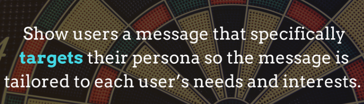
Know who your target audience is, what they need, what problems they face, and how your product or service can solve those problems.
Understand their demographics, preferences, the problems they encounter, and how your product or service solves these problems.
This knowledge allows you to connect more effectively and personalize your messaging to resonate deeply with your visitors
Pro tip: Create buyer personas to visualize and understand your audience better. Regularly update these personas based on feedback and analytics to keep your understanding fresh and relevant.
3. Craft a compelling headline:
The headline is often the first thing visitors see. Make sure it’s compelling and clearly communicates the benefit of your offer. It should grab attention and encourage visitors to stay on the page.
A great headline sets the stage for the entire user experience on the page and primes them for the message and value proposition that follows.
Pro tip: Use A/B testing for your headlines to see which one performs better in capturing attention and driving engagement, thus optimizing your conversion rates.
4. Provide a clear value proposition:
Explain why your offer is valuable in a concise and convincing manner.
Highlight the benefits, not just the features, of your product or service. Why should the visitor care? What makes your offering better than competitors?
Be explicit about the advantages and ensure they are relevant to your audience’s needs and expectations.
Pro tip: Use bullet points to break down complex information into easy-to-digest pieces that quickly communicate the core benefits of your offering.
5. Optimize design & user experience:
According to Klienboost, landing pages featuring tailor-made graphics increase conversions by 13%.
Therefore, design a clean, attractive layout that guides users towards the conversion action, using strategic color schemes and readable fonts.
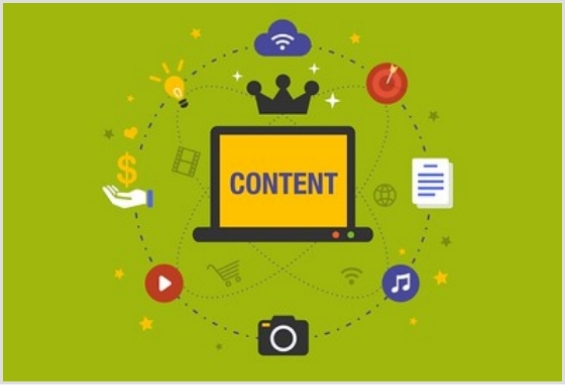
Incorporate relevant, high-quality images or videos to support your message and engage users. Ensure the page looks great and functions well on all devices, especially mobiles.
Pro tip: Keep accessibility in mind by designing for various users, including those with disabilities. This inclusivity can significantly widen your potential audience.
6. Write a compelling copy
Copywriting is an integral part of any type of website, landing page, or sales page. Without a compelling copy, it’s pretty much impossible to grasp the visitors’ attention.
To write a compelling landing page copy, one must use a confident voice, showcase authority, and keep the message crystal clear.
Here are some of the best tips on writing a powerful landing page copy:
- The content on your landing page should be engaging and lead the visitor towards a clear action.
- Use persuasive writing that speaks directly to the visitor’s needs and desires, emphasizing how your offer provides the solution.
- Keep paragraphs short, use powerful calls to action, and highlight key points with bullet lists or bold text.
- Adding necessary information about the offer is always good, but don’t go overboard with it. Too much information or in-depth detail often leads to page abandonment. So, watch out for that.
Pro tip: Employ psychological triggers such as urgency (limited time offer), scarcity (limited availability), and reciprocity (providing something of value before asking for something in return) to enhance persuasion.
You may also like: 7 powerful ways to boost your website traffic
7. Add prominent call-to-action buttons
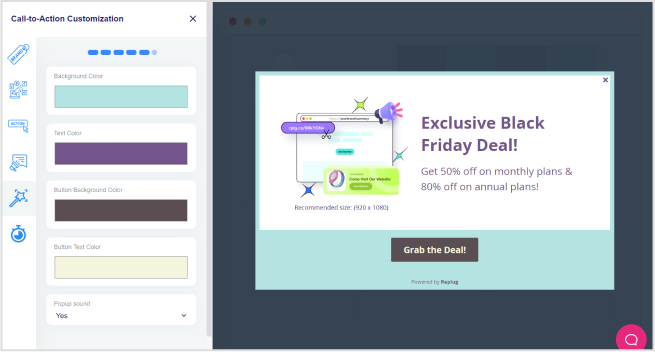
Call-to-action buttons are like road signs that direct your traffic to the right funnels. Without adding clear, prominent, and well-designed call-to-action buttons, it’s not possible to convert visitors into paying customers or leads.
According to HubSpot, customized calls-to-action outperform standard CTAs by a staggering 202%.
The CTAs must be coherent with the color scheme and layout theme so that they go perfectly with the landing page design. However, make sure that they clearly stand out on the landing page. Using similar colors for CTAs as the website design doesn’t work out. So, take care of that.
8. Build credibility with social proof
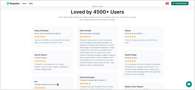
Leverage testimonials, case studies, or endorsements to build trust and credibility. Showing that others have benefited from your product or service can significantly increase conversion rates.
Did you know testimonials increased conversions by 34% for Wikijob.
Pro tip: Display badges of trust like security seals, awards, or media mentions near key conversion points to reinforce credibility.
9. Create and test different versions
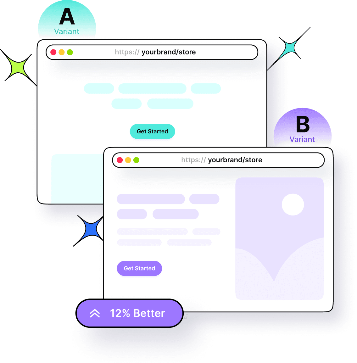
Once you have created the landing page, don’t just get settled with the single design. Instead, A/B tests multiple landing page designs to see which one works best for you.
You can test out different color schemes, layout designs, fonts, and much more. It’ll give you a clear indication of which landing page design outperforms the rest.
Pro tip: When conducting A/B tests for your landing page designs, focus on testing one element at a time to accurately determine its impact on conversions. This approach allows you to isolate variables and make data-driven decisions, leading to more effective optimizations.
10. Track performance & adjust:
Use analytics to monitor how your landing page performs. Look at metrics such as traffic, bounce rate, conversion rate, and user behavior on the page. These insights can help you make informed decisions about what’s working and what’s not.
Pro tip: Set up conversion tracking in your analytics tool to better understand how visitors interact with your page and where they drop off, allowing for more targeted optimizations.
11. Infuse the branding elements
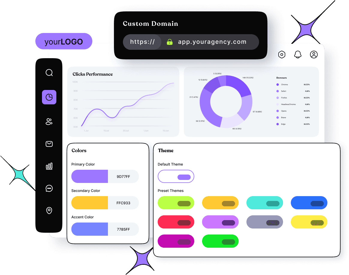
A landing page is usually an extension of your website, and sometimes, hosted entirely under a different domain name. However, in some cases, marketers host the landing page on the same domain. Just make sure that the landing page must have proper branding regardless of the type of landing page.
Here are some of the branding elements to include:
- Decent brand logo
- Attractive landing page design
- Layout color scheme (in line with the brand)
- Suitable font combination
- Beautiful icons
- Unique images
Pro tip: Consistency is key when it comes to branding on your landing page. Ensure all branding elements are aligned with your overall brand identity. This cohesion enhances brand recognition and builds trust with your audience, increasing the likelihood of conversions.
You may also like: Online branding
Pick a suitable toolkit to create
high-converting landing pages
One of the essential steps of creating high-converting landing pages is to pick a powerful tool or a combination of powerful tools. So, we have compiled a list of tools that will make your job easy in creating high-converting landing pages.
1. Replug for creating landing pages and more
Link Management Made Easy
Your go to link management tool for CTAs, branded and bio links, QR Codes, tracking and retargeting.
Get Started for FREE!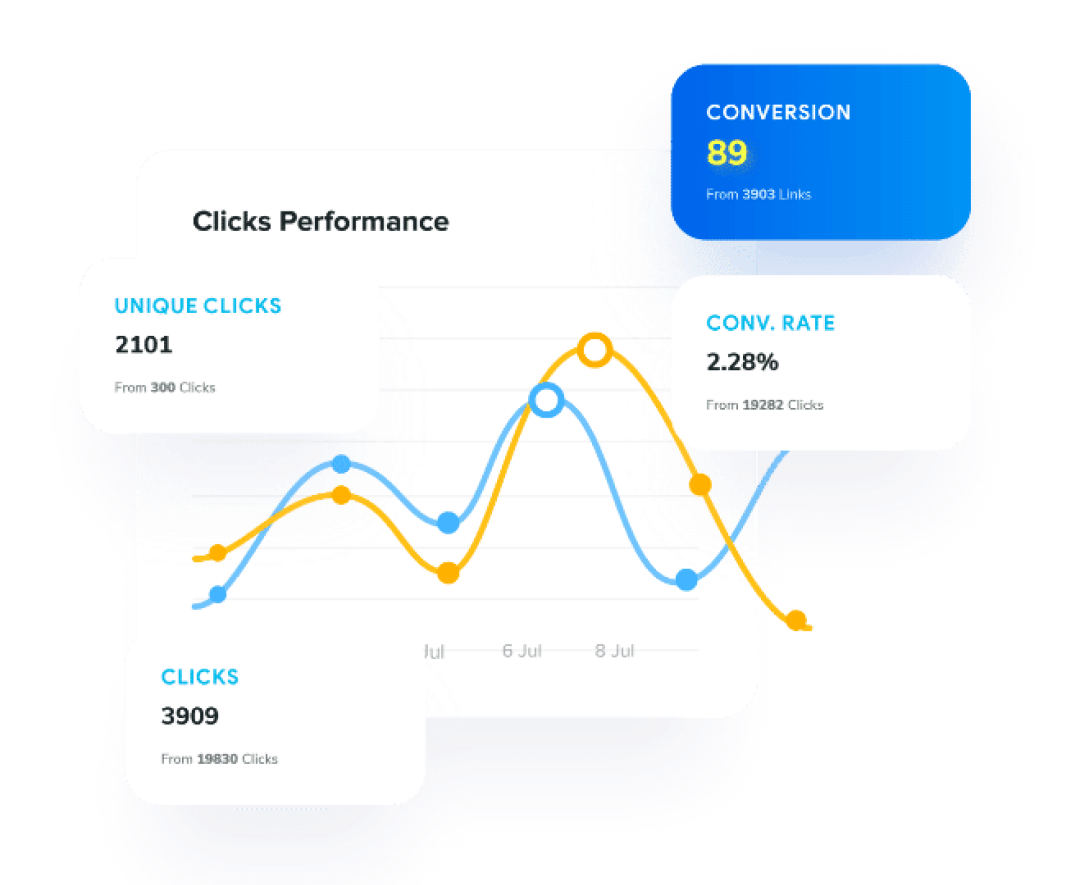
Replug is all in one branded link management solution that allows you to create branded short links, personalized webpages in the form of bio links with your own custom domain, call to actions, deep links, SMS links. Other key features of Replug include:
- A/B test performance of multiple URLs.
- Route traffic with preset conditions and filters, such as time, day, country, etc., using link rotation.
- Retarget audiences using short links.
- Option to add UTM parameters to each link for tracking performance of your marketing campaigns.
- Get click and conversion data tracking with the help of powerful link analytics.
and more.
2. Usermaven for detailed analytics
Usermaven is a privacy friendly analytics tool. It’s useful for understanding demographic and behavior data about your audience.
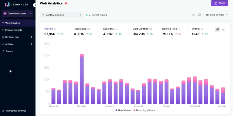
The advanced Google Analytics alternative helps track user interactions and conversions.It also helps monitor detailed metrics about your landing page’s performance.
Get advanced segmentation and funnel analysis features that can help you further understand specific behaviors and tailor your strategies.
3. Adobe Creative Cloud for visuals and designs
When it comes to designing, Adobe is a powerful tool for creating high-fidelity designs and prototypes. Create or edit images and videos for your landing page.
4. TrustPulse for social proof
Integrate social proof with customer testimonials and reviews directly on your landing pages.
TrustPulse will directly boost the credibility of your landing pages. Place them strategically near conversion points, using a mix of quotes, case studies, and video testimonials.
Ensure testimonials are verifiable and represent genuine experiences to humanize your brand and encourage conversions.
5. SurveyMonkey for user feedback:
SurveyMonkey is a powerful tool for collecting user feedback, essential for refining landing pages. They offer customizable surveys and forms that can match your brand, making it easier to gather detailed insights from users. With a variety of question types available, you can extract nuanced feedback to guide targeted updates.
Additionally, both platforms support integrations with CRM systems, email marketing services, and analytics tools, enabling automated workflows and enhanced data utilization for continuous landing page optimization.
Other notable tools
- Google PageSpeed Insights: Use it to get specific recommendations for each identified issue to speed up your site.
- Testsigma: Brings automated testing to your entire workflow, helping teams easily test web, mobile, and APIs at scale with a cloud-based, AI-powered platform.
- Grammarly: Additionally, Grammarly offers tone detection to ensure your copy aligns with the emotional appeal of your brand.
- Hemingway Editor: This tool’s readability score can help simplify complex information, making it more accessible.
- Value Proposition Canvas: This tool can also help to directly align your product features with customer profiles and pain points, ensuring a highly targeted approach.
- BrowserStack: This tool also allows for automated testing across various devices, helping streamline the QA process.
High-converting landing page examples
Let’s take a look at some of the fascinating high-converting landing pages that we came across lately:
1. Growth Sprints
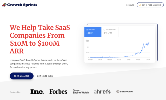
On the Growth Sprints landing page, simplicity remains key, and it’s a key strength. The design is sleek and uncluttered, capturing attention without overwhelming visitors.
The headline cuts to the chase, clearly stating Growth Sprints’ mission: “We Help Take SaaS Companies From $10M to $100M ARR.” It’s direct and concise, devoid of unnecessary embellishments.
Following suit, the subheading hones in on the product, offering just enough information to spark curiosity and prompt further exploration.
What truly sets this page apart?
Rather than inundating users with text, they leverage visuals to illustrate customer progress, making the content more accessible and compelling.
By clicking the “learn more” button, visitors are swiftly directed to the founder’s calendar, streamlining the process and enhancing the user experience for all parties involved.
2. Serpple
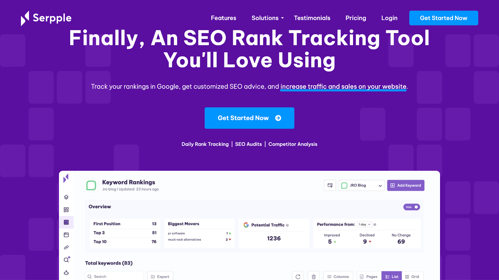
Landing page success doesn’t always demand elaborate designs. Sometimes, a clean layout with clear messaging and a restrained color scheme can deliver exceptional results.
The secret sauce behind Serpple’s high-converting homepage:
- Providing glimpses of their product’s features and functionality helped them enhance transparency, fostering trust with potential customers.
- They considered integrating a few key questions towards the end of the landing page. This proactive approach helps address potential queries and concerns, reducing the need for direct support team involvement.
3. Apple

Apple’s landing pages are renowned for their high-quality design, intelligent utilization of visual components, and effortless user navigation.
The landing page for the iPhone 15 Pro launch effectively captivates the audience with its strategic use of various elements.
Through the incorporation of captivating animations, the standalone page engages users as they scroll, providing a seamless experience.
These animations facilitate smooth transitions, allowing Apple to present comprehensive details about the product in a manner that informs without overwhelming prospective customers.
4. SnapSubscribe
SnapSubscribe is a no-code solution for creating pricing tables for the Lemon Squeezy platform. It lets Lemon Squeezy users create attractive and easy-to-make product pricing tables for customer engagement and conversion.
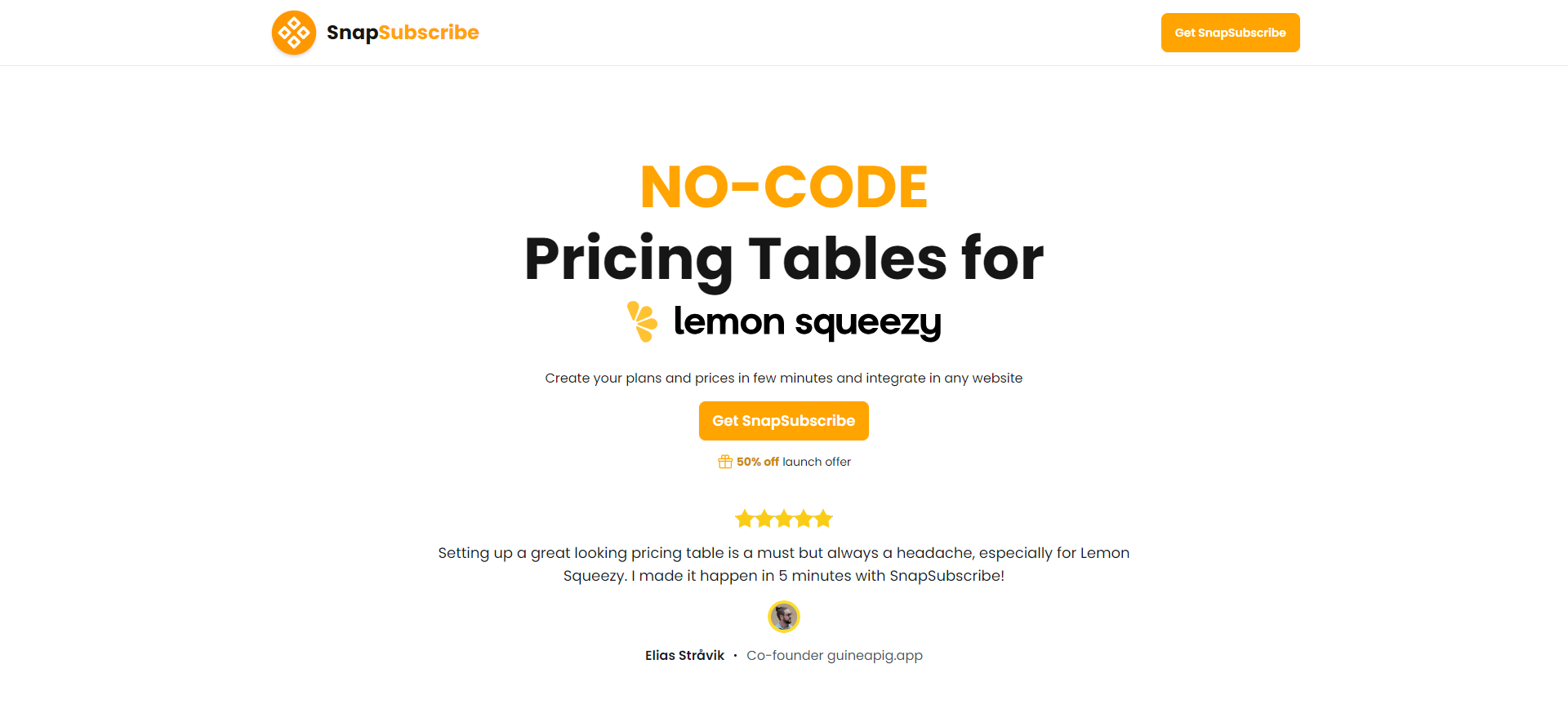
SnapSubscribe’s landing page seems simple, brief, and to the point, and it appears that it’s working for them quite well.
5. Netflix
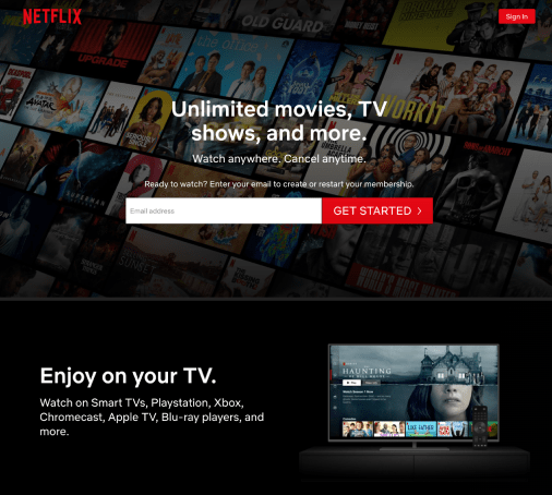
Netflix stands out as a prime example of a minimalist landing page, opting for simplicity to showcase its extensive array of TV shows
This straightforward landing page example emphasizes the key benefits without overwhelming potential sign-ups with complexity.
Here’s what you can learn from their landing page strategy.
- Netflix keeps things simple with its sign-up form, making it accessible to users of all levels of tech proficiency. By requesting only an email address, they ensure that anyone can take the first step effortlessly, regardless of age or technical know-how.
- They address pricing changes in a dropdown FAQ at the page’s bottom, keeping users informed without overwhelming them upfront.
- Unlike the lengthy binge-worthy shows on Netflix, Netflix has short form content on their landing pages so that visitors can quickly digest this landing page in just a few seconds.
Create bio links for Instagram, TikTok, Facebook, Twitter & LinkedIn.
Create fully customizable bio link webpages to drive traffic from and to your social media channels, online store, website and much more.
Learn More!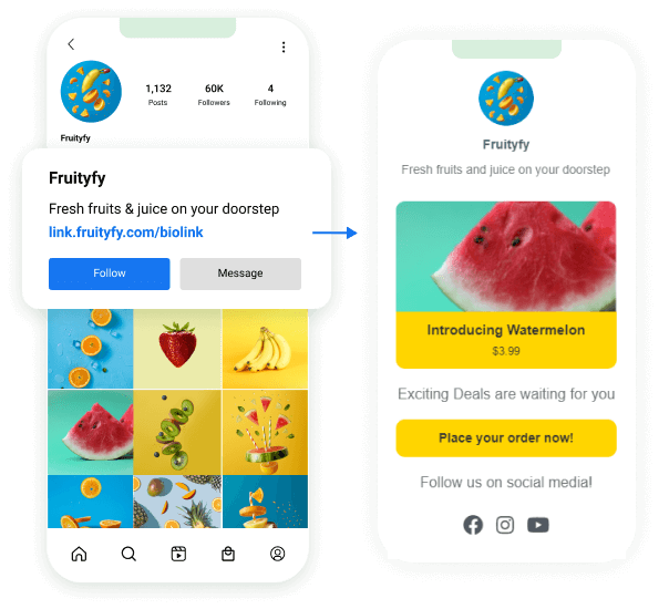
10 Key Performance Indicators (KPIs) for landing pages
Key Performance Indicators (KPIs) for high-converting landing pages are essential metrics used to measure the effectiveness and success of your landing page in achieving its objectives. Here are some common KPIs to consider:
1. Conversion rate:
The percentage of visitors who take the desired action on your landing page, such as filling out a form, making a purchase, or signing up for a newsletter.
Related: How to create a custom CTA for maximum conversion?
2. Bounce rate:
The percentage of visitors who navigate away from your landing page without taking any action. A high bounce rate may indicate that your landing page is not engaging or relevant to visitors.
3. Average session duration:
The average amount of time visitors spend on your landing page. A longer session duration typically indicates that visitors are engaging with your content.
4. Click-through rate (CTR):
The percentage of visitors who click on a specific element on your landing page, such as a call-to-action button or a link. A higher CTR indicates that your landing page is effectively driving engagement.
5. Cost per conversion (CPC):
The average cost incurred for each conversion on your landing page, particularly relevant for paid advertising campaigns where you want to optimize your cost-effectiveness.
6. Return on investment (ROI):
The overall return generated from your landing page compared to the investment made in creating and promoting it. This metric helps assess the profitability of your landing page efforts.
7. Lead quality:
The quality of leads generated from your landing page, measured by factors such as lead-to-customer conversion rate, lead engagement, and lead demographics.
8. Exit rate:
The percentage of visitors who leave your website after viewing your landing page. Analyzing exit rates can help identify potential friction points or areas for improvement on your landing page.
9. Scroll depth:
The percentage of visitors who scroll down the page to various depths. Understanding how far visitors scroll can provide insights into the effectiveness of your content hierarchy and layout.
10. Form abandonment rate:
The percentage of visitors who start filling out a form on your landing page but abandon it before completion. High form abandonment rates may indicate issues with form length, complexity, or usability.
Related: Abandoned cart tips that actually convert
FAQs about creating high-converting landing pages
How do I increase conversions on a landing page?
Make an irresistible offer and create an appealing landing page. A/B tests the design, copy, and CTAs from time to time to see what works best for you. Also, follow the best practices mentioned above for more details.
What are high-converting websites?
High-converting websites are web properties that successfully convert a sizeable number of visitors into subscribers, leads, or paying customers. Every niche or industry has different standards of good and bad conversion rates, but a 3% to 15% conversion is usually considered very good across the board.
What are the key elements of high-converting landing pages?
The landing page key elements include headlines, sub-headings, copy, media content, color scheme, layout and design, offer, opt-in forms, and call-to-actions.
Why do landing pages convert better?
The most common reason why landing pages convert better is that they’re specifically designed to attract, engage, and convert the target audience with a laser-focused content strategy around a single offer. You won’t find multiple offers on the same landing page. This is why landing pages are better than regular website pages or blog posts when it comes to conversion rate.