Ever heard of the term CTA button?
Whether you’re familiar with it or not, chances are most of us have encountered different types of calls to action while browsing websites or social media platforms.
For instance,
You might have clicked on a “Learn More” button and ended up landing on a page containing more information related to that topic.
Or you might have clicked on a “Buy Now!” call to action button that takes you to a product page or a similar web-page.
Now why do they matter?
CTA buttons matter as they point users towards a desired action.
Hence, the name of the term is “Call to Action”.
What is a call to action button?
A call to action (CTA) button is a clickable button or link on a website, advertisement, or piece of content that encourages the audience to take a specific action.
CTAs can drive a variety of different actions depending on the content’s goal, such as generating leads, making a purchase, or subscribing to a newsletter.
CTAs are crucial to generating leads from a website, and can help motivate visitors into deeper engagement with a brand.
Related: 60 Best Call To Action Phrases To Increase Click Through Rates
Why is a CTA button important?
CTA buttons are important because they act like helpful guides on your website, pointing visitors toward valuable content or actions that benefit both you and them. Here’s why:
Benefits for visitors:
- Clarity: They tell visitors what to do next, eliminating confusion and helping them find what they’re looking for faster.
- Convenience: They offer a one-click path to things like downloading resources, starting free trials, or contacting you.
- Value: They highlight content or actions that can solve their problems or improve their experience.
Benefits for you:
- Conversions: They encourage visitors to take specific actions, like signing up for a newsletter or making a purchase.
- Engagement: They keep visitors actively interacting with your website and exploring what you offer.
- Data: They provide valuable data about what actions users are most interested in, helping you make better decisions about your website content and marketing strategy.
Branded Short Links
Create and track branded short links for your business for better conversions.
Brand Your Links Now!
Different types of CTA buttons to boost your CTR
CTA buttons can vary in style and size depending on your goal conversion and website style. Each type has a specific purpose and works best in different situations.
Let’s explore some common ones:
1. Lead generation:
Imagine offering a free e-book in exchange for an email address. Your CTA button could be “Get Your Free E-book Now!” and placed prominently near the e-book description.
2. Form submission:
This CTA helps gather visitor information, like “Sign Up for Our Newsletter” on a blog or “Tell Us Your Needs” on a contact page.
3. “Read More” button:
If you have snippets of longer content, this CTA encourages visitors to delve deeper, like “Read the Full Article” on a blog post preview.
Related: Call to Action for Social Media
4. Product or service discovery:
This CTA leads visitors to explore your offerings, like “Browse Our Collections” on a clothing website or “Discover Our Services” on a marketing agency page.
5. Download now:
After someone signs up, a CTA like “Download Our Beginner’s Guide” keeps them engaged and learning more.
6. Purchase CTA button:
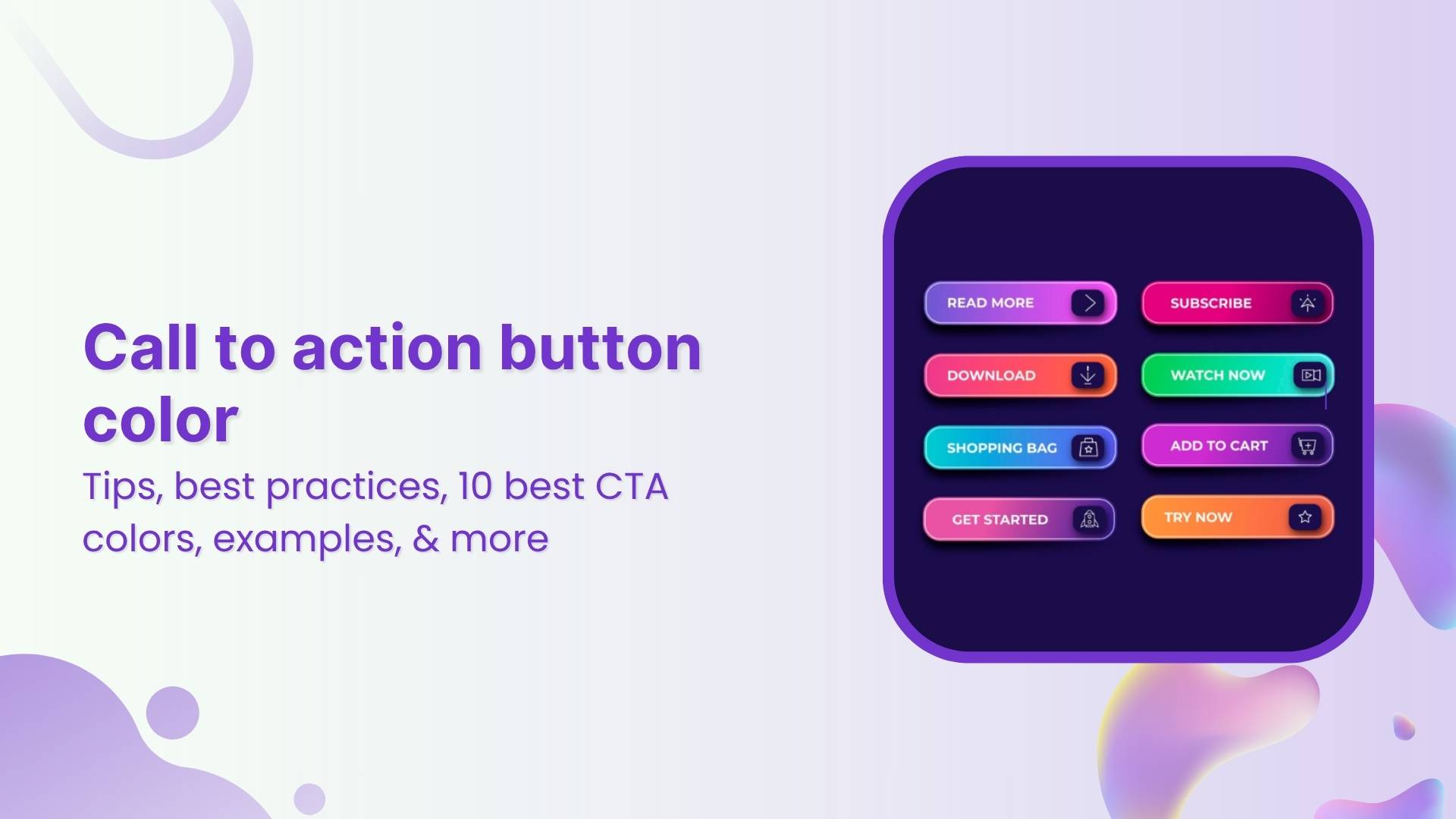
On product pages, a bold “Buy Now” or “Add to Cart” button prompts immediate purchase.
7. Demo/Trial CTA:
Let visitors try before they buy with CTAs like “Start Your Free Trial” or “Book Your Demo Today.”
8. Contact us:
Make it easy for people to reach out with a clear “Contact Us” or “Chat with Us Now” button.
8. Banner CTA
A Banner CTA, is a visually prominent element usually displayed at the top or within a webpage, often in the form of a banner or button. These banners are strategically designed to be eye-catching, fostering user engagement and interaction with the intended goal.
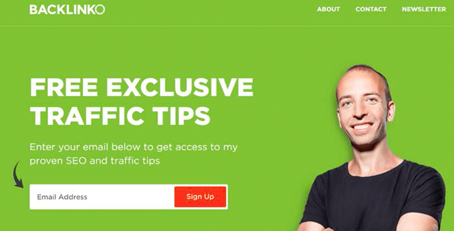
9. Social sharing CTA
Social sharing CTA, or Call to Action, is a prompt strategically placed on a website or social media platform to encourage users to share content, such as articles, images, or videos, with their network.

Related: How to create a custom CTA for maximum conversion?
Best practices for designing an effective CTA button
- Tell them what to do: Use strong verbs like “Download” or “Learn More.”
- Highlight the benefit: What do they get by clicking? Free guide? Exclusive content?
- Short and sweet: Keep the text easy to read.
- Make it stand out: Use contrasting colors and good placement.
- Mobile-friendly: Easy to tap on any device.
Remember, good CTAs guide users and improve their experience.
Bonus Tip: Replug is a tool that lets you design different types of CTAs like buttons, forms, and even pop-ups, without needing any coding skills. Plus, you can track how well your CTAs are performing to see what resonates with your audience.
Related:How to Create a CTA Campaign Using Replug?
3 best call-to-action button examples
Ready to see some great CTA strategies in action?
Here are 3 stellar examples:
1. Netflix: “Join Free for a Month”
It is clear, concise, and gets straight to the point.
Because it’s:
- Free: Who doesn’t love trying something new for free?
- Limited: Only a month to explore, so dive in quick!
- Easy: Joining = binge-watching heaven awaits.
- No pressure: A month lets you try before you commit.
2. Airbnb: “Try Hosting”
This button taps into users’ curiosity and encourages exploration.
It is because;
- Intriguing: “Try Hosting” piques curiosity without making a big commitment.
- Open-ended: It invites users to explore the possibilities of hosting without pressure.
- Low barrier to entry: “Try” suggests it’s easy to get started and see if hosting is right for them.
Overall, it’s a smart way to encourage people to consider being Airbnb hosts without feeling overwhelmed.
3. “SPIN FOR A CHANCE TO SAVE” – TOMS
The “Spin for a Chance to Save” technique used by TOMS can be an effective way to grab attention and spark interest, especially for younger audiences. Here’s why:
It is because;
- Gamification: Spinning a wheel is a fun and interactive way to engage users, making them more likely to participate compared to just clicking a button.
- Surprise and anticipation: The mystery of what someone might win adds excitement and keeps them invested in the process.
- Potential reward: Even if the savings aren’t guaranteed, the chance to win something appealing can motivate people to try.
Remember, your CTA buttons are your website’s secret weapon. Craft them with care, and track your clicks (and conversions) soar!
FAQs
What is a call to action button behavior?
A Call to Action (CTA) button prompts users to take a specific action, such as making a purchase or signing up. Its behavior should be clear, compelling, and guide users toward the desired action.
What should a call to action button say?
CTA button text should be concise, action-oriented, and aligned with the desired action. Examples include “Buy Now,” “Sign Up,” or “Learn More.”
How do I create a CTA button?
Use Replug’s CTA builder to design and customize your button. Specify the action, craft compelling text, set the button link, define the target audience, and save and implement the CTA on your website.
You may also like:
- How to Create Affiliate Links and Keep Track of Affiliate Results?
- 5 Top Link Rotators: Convert More with Traffic Routing


