You’re running an e-commerce store with top-notch products, vibrant themes, detailed listings, and genuine reviews. Coupled with high-end SEO and social media marketing campaigns.
Everything seems in place, but your conversion rates need to hit the mark. Then what’s the missing piece? Let us clue you in – it’s the absence of an advanced call-to-action tool!
Using an advanced call-to-action tool can make all the difference by converting your website visitors into paying customers.
With strategic placement and catchy texts, CTAs compel users to take specific actions. Which ultimately helps you in boosting brand revenue potential.
Still confused? Don’t worry guys. In today’s blog, we’re covering everything from the finest CTA tips to the most cutting-edge CTA tools. Let us get you started.
What’s a CTA?
CTA stands for “Call to Action”. It’s an instruction that tells your audience what you want them to do next. These are commonly found in marketing and advertising but can be used anywhere you want to guide users toward a specific action.
What is a good call-to-action example?
A good example of a call-to-action is a clear and simple statement that tells users what to do next. For example, ContentStudio’s CTA “Try it for free” invites users to explore the tool without any commitments.
Best call-to-action tips to use
1. Try to use action verbs
Action verbs are the powerhouse behind persuasive CTAs. They prompt users to take immediate action, driving them toward the desired goal. Incorporate dynamic verbs like “discover,” “explore,” or “get” to instill a sense of urgency and motivation in your audience. Grab attention, Drive action!
Communicate the value proposition clearly in your CTAs. Highlight the benefits or rewards users will receive by clicking through, whether it’s accessing exclusive content, unlocking special discounts, or gaining valuable insights. The more value users perceive, the more likely they are to act.
3. Create FOMO
Creating a sense of FOMO (Fear of Missing Out) is a potent tactic to drive action. Hint at limited-time offers, exclusive deals, or upcoming events to instill urgency in your audience. By suggesting that time is running out, you motivate users to act quickly to seize the opportunity.
4. Use fancy graphics and colors
Visual appeal is key to capturing attention and enticing clicks. Incorporate eye-catching graphics, vibrant colors, and captivating imagery to make your CTAs stand out. Choose visuals that align with your brand identity and message while grabbing the user’s attention.
Experiment with unique shapes or sizes for your CTAs to make them visually appealing and memorable. Whether it’s a bold button, a playful icon, or a custom design element, think outside the box to create CTAs that stand out and invite interaction.
6. Keep the text brief
Keep your CTA text concise and to the point. Avoid overwhelming users with too much information. Instead, focus on conveying your message succinctly, highlighting the key action or benefit users should take.
7. A/B test multiple CTA’s
Don’t settle for the first iteration of your CTAs. Experiment with different variations, including text, design, placement, and color scheme, to identify what resonates best with your audience. A/B testing allows you to optimize your CTAs for maximum effectiveness and drive better results over time.
Top call to action tools to use
1. Replug
Link Management Made Easy
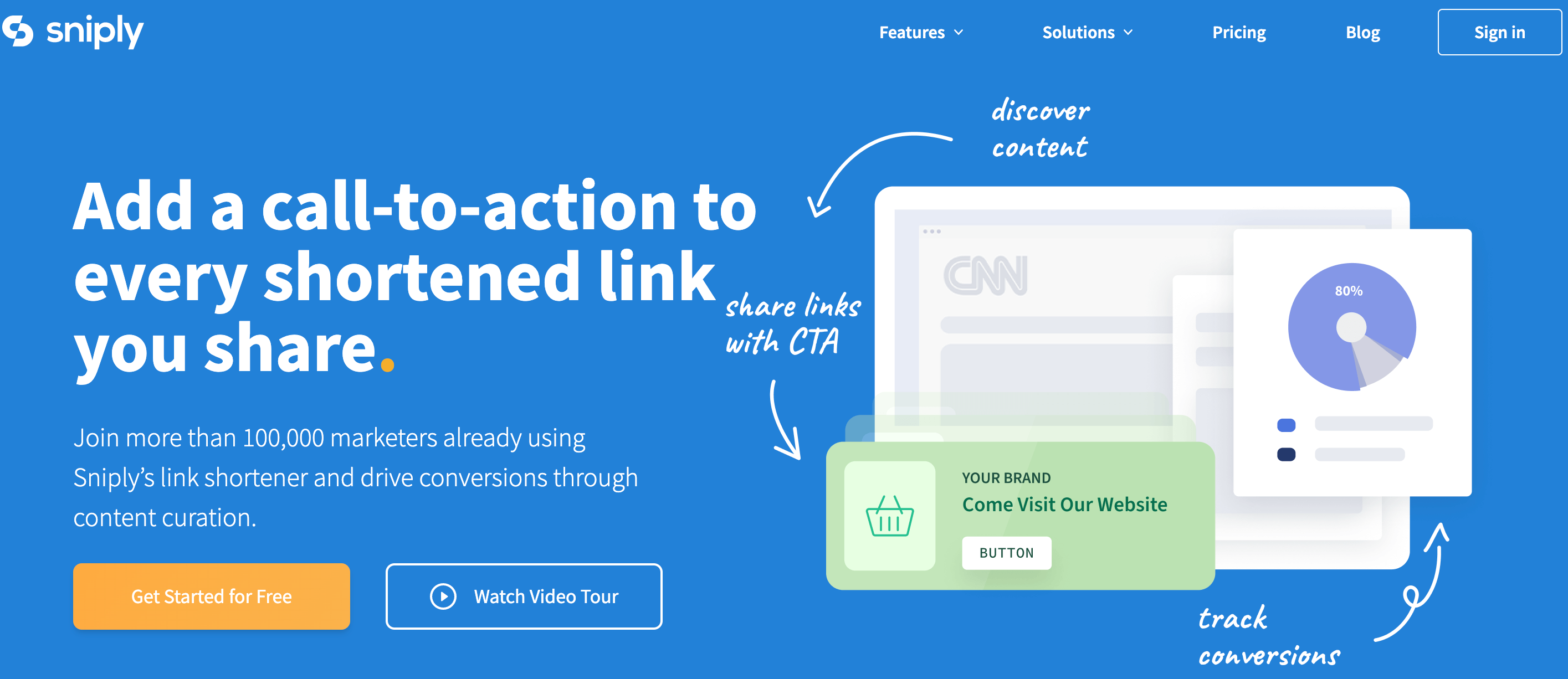
Your go to link management tool for CTAs, branded and bio links, QR Codes, tracking and retargeting.
Our top favorite is Replug – a powerful link management platform that allows users to create branded short links, track click data, and retarget audiences across various digital channels.
In terms of CTA generation, Replug enables users to embed call-to-action (CTA) overlays or pop-ups on shared links, directing traffic to desired landing pages or offers.
You can obtain detailed information about your website traffic, including the country, browser, device, and date, giving you precise insights into your audience.
HubSpot’s CTA tool is part of its comprehensive marketing automation platform, designed to help businesses attract, engage, and delight customers. With its CTA tool, users can create visually appealing CTAs that seamlessly integrate with their website or email campaigns.
Moreover, these CTAs are strategically placed to prompt visitors to take desired actions, such as downloading a resource or requesting a demo.
Scalenut is an AI-powered content marketing platform that helps businesses create, distribute, and optimize content at scale.
The platform offers a free CTA generation tool. By understanding user intent and preferences, Scalenut assists in generating CTAs that resonate with target audiences.
Canva is a versatile design platform that empowers users to create stunning graphics, presentations, and marketing materials with ease.
While not a dedicated CTA tool, Canva provides users with the tools to design eye-catching CTAs that complement their branding and messaging. Users can create custom graphics or templates for CTAs to be used across various digital channels, from social media posts to website banners.
Things to consider when choosing your CTA tool
Here are some of the most important things to consider when choosing your CTA tool.
Consider your budget: Free options offer good basic functionality, while paid tools might have advanced features like A/B testing or performance analytics.
Think about your needs: Do you need a simple CTA builder or a tool with AI-powered suggestions? How important is customization for you?
Read reviews and comparisons: Researching user experiences can help you find a tool that works well for others in your situation.
The best CTA generation tool is no other than Replug. This is because:
Easy to Use: Replug doesn’t require coding knowledge. Get a free CTA builder specifically designed to craft compelling CTAs with customizable text, buttons, forms, and pop-ups.
Targeted CTAs: Replug allows you to define your target audience during CTA creation. This ensures the CTAs you build resonate with the specific user group you’re aiming for.
A/B Testing: Replug integrates A/B testing so you can track CTA performance and see which variations drive the most conversions. This data-driven approach helps you continually optimize your CTAs for maximum impact.
Retargeting capabilities: It enables users to maximize conversions by embedding CTAs directly within shared links, ensuring targeted audiences are directed to relevant landing pages or offers.
Overall, Replug’s combination of advanced features and ease of use makes it ideal for businesses looking to drive engagement and conversions effectively.
FAQs
What is an example of a call to action in AI?
AI can analyze vast amounts of data to understand user behavior, preferences, and context, allowing businesses to tailor their CTAs for maximum impact.
Some of the common examples include:
Sign up today
Download now
See how it works
Join now
What is a strong CTA?
A strong CTA combines clarity, relevance, and urgency to compel users to take the desired action. It communicates the value proposition briefly and motivates users to act without hesitation.
What is a call to value instead of a call to action?
A call to value focuses on highlighting the benefits and value proposition offered to the user rather than explicitly instructing them to take action.
What is a secondary call to action?
A secondary call-to-action serves as an alternative action for users who may need more time to be ready to commit to the primary CTA. It provides additional options for engagement, such as downloading a resource, exploring related content, or joining a mailing list, catering to diverse user preferences and behaviors.
Manahil
Meet Manahil – A B2B & B2C writer with 4 + years of experience, known for turning insights into impactful content. Her words engage, inform, and drive real results.
Mustafa Niazi
Mustafa Niazi is a blogging addict, a tech fanatic, and a SEO specialist.
A CTA is a prompt on a website urging users to take specific desired actions. Personalizing CTAs enhances online presence and user engagement.
Types of CTAs:
Subscription, Button, Form, Read More, Social Sharing, Sign Up, and Demo/Free Trial etc. CTAs cater to various purposes.
Best practices:
Ensure visibility, use eye-catching button colors, keep it short and simple, use compelling action verbs, and create a sense of urgency.
Creating a CTA with Replug:
Sign in, navigate to campaigns, start a new CTA campaign, select brand, choose CTA type and theme, customize, enable, add message, set timer or activate “exit intent,” save, and monitor performance.
Personalized Call to Actions (CTA) perform 202% better than basic CTAs, as they align with users’ buyers’ journeys and preferences
In the online world, where websites compete for attention, creating personalized Calls to Action (CTAs) is an essential strategy.
A well-crafted CTA is not merely a button; it’s a gateway to engagement, conversion, and a thriving online presence.
In this comprehensive guide, we’ll explore what a CTA is, delve into various types, understand best practices, and create personalized call to action for a website using Replug.
What is a call to action for a website?
A call-to-action (CTA) is a prompt on a website that tells the user to take a specific action, such as “Sign Up” or “Buy Now.”
It’s usually a button or link that’s super important in digital marketing. It helps users know what to do next on a website or how to complete a specific action.
CTAs can vary from simple requests to more demanding actions, and they are designed to encourage user engagement and lead them through the sales funnel.
In simple terms, a CTA is a direct invitation for the user to do something, like making a purchase, signing up for a service, or downloading a resource.
Not all Call-to-Action solutions fit everyone. Avoid using “Click Here” on a red button everywhere. Figure out the right call-to-action for your needs.
Here are various types for different purposes.
1. Subscription CTA:
Encourage visitors to subscribe to newsletters for regular updates.
2. Button CTA:
Prompts action with a clickable button, often leading to a transaction or next step.
3. CTA Form:
Engages users through interactive forms, gathering valuable information.
4. “Read More” or “Find Out More” CTA:
Invites further exploration into relevant content or offers.
5. Social sharing CTA:
Encourages users to share content across social platforms, expanding reach.
6. Sign Up CTA:
Prompts users to sign up for exclusive access or membership.
7. Demo or Free Trial CTA:
Offers users a hands-on experience, creating a sense of product/service value.
5 best practices for creating a perfect call to action
Keep reading till the last line of this blog post and get a surprise reward!
Well, now that we’ve got your attention, let’s dive into the call to action best practices that you should consider;
1. Make the CTA visible:
Ensure your CTA stands out by using contrasting colors, average white space, and strategic placement on your website.
2. Eye-catching CTA button colors:
Bright and vibrant colors grab users’ attention and make the CTA button inviting.
3. Keep it short & simple:
Craft concise and actionable text directly tied to your specific offer. Clarity is key.
4. Clear & compelling action verbs:
Elevate engagement by choosing dynamic verbs like “get,” “read,” or “try” over other terms like “submit.”
5. Create a sense of urgency:
Encourage users to take action quickly by incorporating time-sensitive offers or limited availability. Urgency sparks action.
Dive into customization by adding background colors, text colors, and CTA button colors that align with your brand identity.
Step 7: Enable call to action
Assign a name to your campaign, activate the call-to-action in the widgets, and proceed to the next step.
Step 8: Add your message
Write what you want to be displayed as CTA and a link to your site.
Step 9: Set the timer or activate “exit intent”
Decide when your CTA should appear on your website. You can also enable the “Exit Intent” option for strategic timing based on user behavior.
Step 10: Save your campaign and check performance
Save your campaign, and leverage Replug’s analytics features to monitor and analyze its performance over time.
Conclusion
Crafting personalized CTAs is an ongoing process of refinement and adaptation. With a strategic approach and the right tool like Replug, your website can become a hub of meaningful interaction.
Improve your online presence by instilling purpose into each CTA, guiding every click toward success.
FAQs on call to action for a website
Is call to action a strategy?
Yes, incorporating a call to action (CTA) is a proven strategy to prompt desired actions from your audience.
What is CTA in a blog?
CTA in a blog refers to a “call to action,” which is a directive prompt aimed at encouraging readers to take specific actions, enhancing engagement.
What is the best CTA?
The effectiveness of a CTA depends on your specific goals and target audience. Customize your call to action to align with your objectives and resonate with your readers. Ideally, it should include action words like “get,” “now,” “sign in,” etc.
Meet Mahnoor, the tech enthusiast who works magic with words for B2B and B2C SaaS platforms. Turning tech talk into fascinating stories is her specialty, making brand messages clear and exciting. She's the storyteller companies wish they had!
In a world brimming with distractions, capturing and holding attention has become an art. Whether you’re a marketer, a business owner, or simply someone aiming to make an impact, mastering the art of the Call-To-Action (CTA) is essential.
A well-designed CTA can transform passive onlookers into active participants, driving conversions and propelling your goals forward. But what does it take to create the perfect call to action that compels, entices, and converts? Join us as we uncover the secrets behind crafting CTAs that leave a lasting impact on your audience.
Get ready to uncover the secret to irresistible attraction and unleash a new era of engagement.
What is a Call-to-Action?
A Call-To-Action (CTA) is a prompt or instruction designed to encourage a specific response or action from the audience. It is typically presented as a clear and concise statement, often accompanied by a visually distinctive button or link.
CTAs are commonly used in marketing and advertising to guide users toward a desired action, such as making a purchase, signing up for a newsletter, downloading a resource, or requesting more information.
The purpose of a CTA is to motivate and engage the audience, driving them to take the next step in their journey, ultimately leading to conversions and achieving specific business goals.
Your website might have won the best website award or could be a slick content source, but your efforts could go futile if your audience fails to understand the workflow. That is why you need to cite your websites with a helpful call to action; to help users progress through your website easily.
How to create a perfect call to action? Explained with the best call-to-action examples:
When it comes to capturing your audience’s attention, design takes the spotlight. As the first element they encounter, it has the power to leave a lasting impression. By choosing the right color palette and crafting compelling words, you can effortlessly sweep your audience off their feet.
Now, let’s delve into the captivating world of CTA design schemes. Discover how you can skillfully play with colors, typography, and layout to create CTAs that not only catch the eye but also drive meaningful engagement.
Psychology of Colors in CTAs:
We all experience and perceive colors differently. The vibe we get from different colors strums the strings of our brains and settles in the subconscious part of our minds.
Researchers found in a study, impact of color on marketing, that 90% of the immediate judgment about a product is greatly affected by its color.
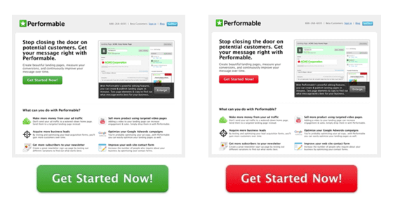
An item that stands out attracts more eyeballs toward itself. The importance of color could be magnified by this example below.
An ordinary alteration like a change in button color can boost conversions. The boost in conversion was noticed by doing a very ordinary alteration; a change in button color.
The red colored ”Get Started Now” CTA boosted conversions by 21%. Keeping this example in mind, imagine what you can achieve by changing just the color of a button.
There you go; a very simple yet revolutionary tip can turn the tables for you.
Nevertheless, the idea is not to use blazing colors in your CTAs, but the idea is to make the CTA stand out from the background.
In this example, the page is constructed on a green palette. A green-colored CTA simply blends in with the background and doesn’t pinch the viewer that much. Whereas, the contrast of the bright-colored CTA button adds to its captivating.
Let’s see how Shopify grabs your attention with its CTAs. The current call to action they use on their website looks like this:
But before this, during the past few years, they had been constantly trying to improve the look of their CTA. In 2013, they advertised these versions of CTA ads.
The predominant version of their CTA till 2016 was
You can also get the maximum lead by playing with your CTAs and improving their outlook.
Use smart wordplay in your CTA:
Overlooking your website’s call to action is synonymous with wasting hours of effort spent on creating one. Be it the colors or the text of your CTA, it should be well thought out.
Don’t use mainstream CTA words such as ”Buy Now”, ”Download” or ”Click This”. Such boring words could destroy your conversions. Instead, use the words that go best with the idea of your product.
Because you don’t want your users to think that you are a brain-fed robot prone to go with worn convention.
Choose the words wisely!
Let’s see this example:
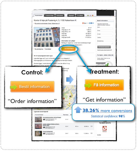
Let’s take an example of this case study; changing one word in the call-to-action of the B2B website generated a 38.26% lift in conversions.
Here the weighted value of the words “Order” and ”Get” can be measured.
Apparently, both these words are used to nudge the user to click on the CTA to buy your product. But take a look at the psychological effect these words have.
The word Order indicates what the user has to do- no anticipation for the end result is built for the user. Conversely, the word Get emphasizes the end result- what the user is going to get if they click on the button.
And just like the colors of your CTA, your text has to be discrete too.
There is a fine line between being unique and being extra. However, don’t lose your originality at the verge of being unique.
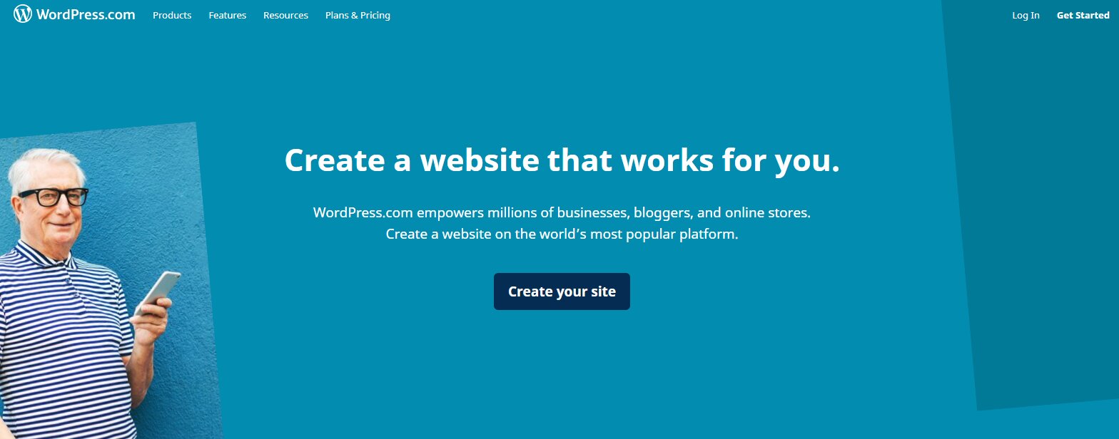
The secret is to resonate with your product. Let’s take an example of WordPress and how they’ve shaped their CTA.
So, spend some time associating your CTA with your business story.
What is a business story?; you must ask.
Let me spell it out for you.
Use the power of storytelling:
Have you ever heard about neural coupling?
It is a phenomenon that illuminates the storyteller’s and the listener’s brains in the same areas.
You must have witnessed unwitting attention when you start listening to a story.
A story is the compilation of events in such a manner that it reverberates maximally with our neural cells. In easier words, we ought to remember information in the form of a story much easier than plain facts.
When you are writing the text in your CTAs, the wording needs to complement the story’s rhythm. Let the readers feel the emotions and make them empathize with your concepts.
Tommy Walker states in a blog that the purpose of the CTA is to build anticipation. The effective CTA is not created by smart wordplay, it is insurance to the reader that your story gets better when they sign up.
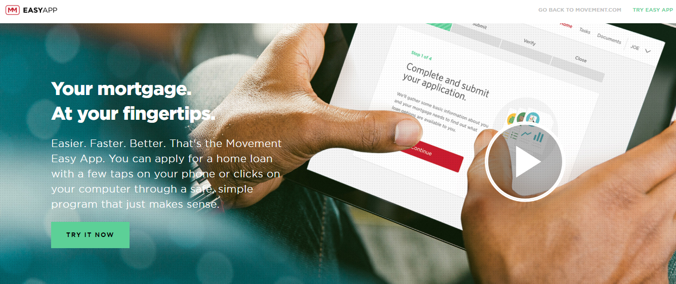
Let’s take a look at the example of Movement Mortgage:
Their concise CTA “Your Mortgage At your fingertips” is appealing enough for the user to click on the “Try it now” button.
The information they’ve provided on their landing page is neither insufficient nor overwhelming.
Fear and love are the two powerful forces that drive mountains. Love is difficult to understand, so let’s use fear in our marketing strategies.
Sometimes, you have to use alarming words in your call to action to sell your deal. Instead, use words that create urgency and enchant the viewer to click on them.
If you succeed in making your users believe that they’ll miss out on the hot deals if they don’t click on the CTA. The fear of missing out will push the users to check out the deal before the time runs out.
Simplicity brings out elegance, and elegance is attractive.
If you can explain something while keeping it simple, why go down the hard path?
Simplicity could be used to sprout curiosity in the viewer’s mind which elicits them to explore more of your offerings.
Unamo, a tool for marketers, sets a live illustration of simplicity.
You can see in the screenshot that the words used on their landing page are quantifiable and ignite questions in the reader’s mind. And, to unveil the details, the users are invited to learn more via a call to action.
Be direct:
If you own a renowned brand, you don’t need to splash unnecessary information on your website. People already know you and your specialties. So be direct, swab away all the explanations, and directly introduce your user to your offer.
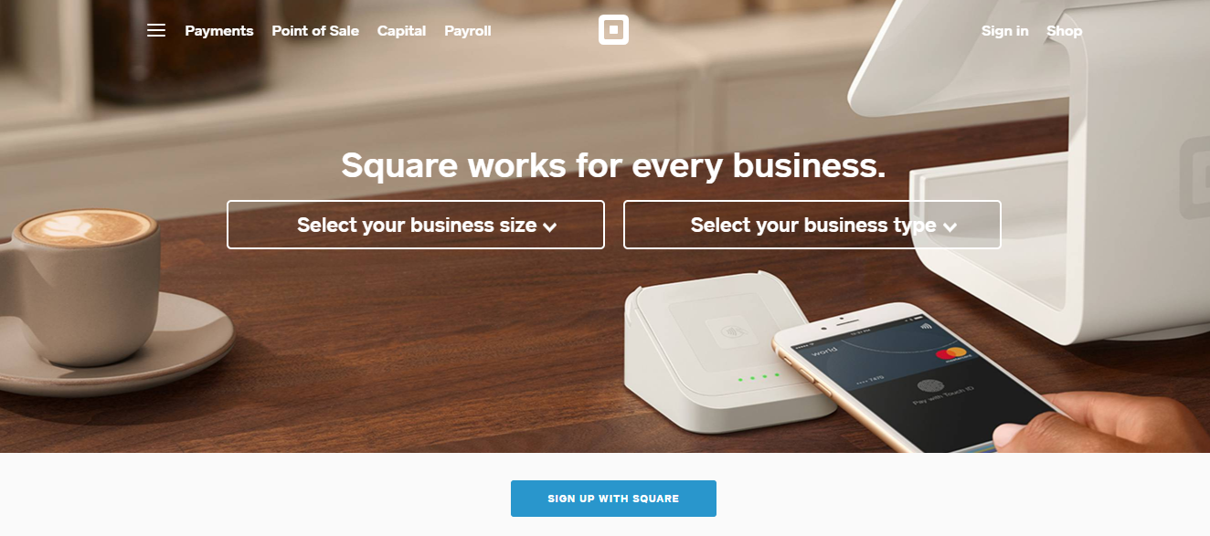
Square, a credit card processing tool, aces the use of CTA by direct targeting. Check out their landing page in the screenshot below.
On their website, they have taken advantage of the fact that people are already acquainted with them. Look at how sleekly they have made use of CTAs.
People know their business and visit the website to sign up. And there it is, right in front of their eyes, they don’t have to search for it. The effective targeting and agile placement bring in the exact audience that Square hopes to convert.
Use CTAs According to Your Funnel:
Your audience can be at different stages of their customer journey while coming across your offering. Therefore, the personalization and customization will add more relatability for them, and they are more likely to convert through a specific call to action.
This can be done by customized CTAs according to the type of content, whether it’s awareness level content, consideration level content, or conversion level content. Therefore, Retargeting CTAs can be more specific than awareness campaign CTAs.
For example,
Let’s look at Slack’s case study and how it caters to different audiences through different CTAs on the same page.
Slack has two CTA buttons on its features page. This page caters to two types of audiences. One who is in the mid of their research stage and is learning and exploring the tool’s features. The second CTA targets people who are in the last stage of their customer journey and want to sign up for the tool.
In addition to these, they also have several other CTAs on their page where they offer you to talk to their sales team for more information and understanding of the offerings. So again, this is a great example of catering to different audiences at different customer journey stages.
Here’s another example:
Nintendo’s website is another example of moving down your audience in the funnel through effective CTAs. They answer the questions of their visitors by answering them through a CTA button. For example, here they have the CTA of “Compare Features”, which enables their customers to research the options.
Having relevant CTAs according to where your visitor is in their customer journey will enable you to drive conversions by maneuvering their journey.
You can now see just how important little CTA tweaks can be.
Credibility is one of the core values in the online and offline world for converting our visitors into customers. That’s why you must pair your CTA with the content which adds authenticity to your offerings.
One way is to use testimonials as social proof that your services have been tried and tested by real users. Social proof and reviews from other people make a substantial difference in your customer’s decision-making.
For example,
In this post, Neil Patel Digital used the testimonial of a business owner to share her experience of working with Neil Patel. After this feedback, people are more likely to explore the offerings by clicking on the CTA at the bottom.
Another way to pair your CTAs with selling content is to add numbers and compelling statistics. These statistics also prove your credibility that there is already a high number of people who trust your services, products, or current offering. This also creates a sense of urgency by making people realize that they might be missing something.
For example, Neil Patel uses his organic results on CTAs to attract visitors to attend his webinar. With this copy, people are more likely to explore the tricks and tips to increase their website traffic.
Right contextual placement is crucial:
Using a CTA on your website is essential but its placement is the tricky part.
A well-placed CTA is likely to gain more leads than a misplaced CTA which is not backed up by a powerful story.
Don’t we all crave harmony in our lives?
Just like that, you as a marketer should harmonize all your call to action on your website. Create a story on your website and make the end-user a part of your selling story.
A logical story will create momentum in the user’s brain to figure out your product’s value.
To make sense to the user, everything has to be in context.
Let’s say you have a website and your motto is to promote your product. After highlighting one of your key features, invite the user to try out that feature via a CTA right below the description. This will encourage the user to click on the CTA to substantialize the concept they’ve just learned.
Make the user’s visit worthwhile so that they appreciate the sweet symphony your service provides them.
The relevance of your content with your CTA matters equally as the quality of both, if not more.
If you don’t place your CTAs in the right context, the users will be confused about their next move. Thus, they will get intimidated and bounce off of your website.
Check out how smartly Lynda’s CTAs integrate with the offers they sell.
The CTA is placed right above the offered courses, directing the users to start a free trial right away. The point to notice here is that had the CTA been present elsewhere, it would have been cumbersome for the seeker to find the CTA to move forward.
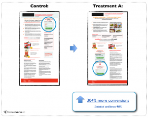
Another perspective explains that for complex websites, it’s better for the CTA to reside below the fold. ContentVerve reinforces this statement by providing us with some facts and figures.
So, according to their study, CTAs placed at the bottom of complex products and service websites gained 304% more conversion than if the same CTA were placed at the top.
This theory is not a game-changer though, as the concept is to stay consistent. If you have a product that needs plenty of description for the viewer to digest, don’t risk skipping the important message.
Remember that the expanse of your CTA is wider than just pixels and colors. It’s about creating psychical chemistry with the onlooker.
Customer feedback:
At this point, you pretty much are on the expert ladder to incentivize your CTAs.
The next thing to take care of; is customer feedback and customer satisfaction score. Your website should be understandable by a wider audience and elucidate their cognitive curiosities.
Even if you have created a classic CTA for your website that withstands all the rules, you still have to rely on the end user. Because an impartial user attains an unbiased experience of your website.
Value the feedback of your customers. Make sure that your users understand the workflow of your website properly. Revise and upgrade your design to the extent that your website becomes a piece of cake for the coming traffic.
How to use CTAs in a Blog:
A Call-To-Action may defer in its guise, but the essence remains the same; i.e. to lead the visitor toward their next step.
Above are some examples of CTAs being used in the home website to guide the visitor toward their next move.
CTAs could also be used for brand marketing as well. The use of such CTAs could easily be staged in a blog.
For example, if you’re explaining a new feature in your blog or creating relevancy with your product, you could escort the user toward the landing page of your home website via a powerful CTA. This could be done on different channels.
Voila! You can generate leads even when the audience is not present on your website. But how do you do it?
Replug is a powerful tool that allows you to easily create and customize calls-to-action (CTA) on your website. With its user-friendly interface, you can quickly design CTAs that match your brand’s style and aesthetic by adding colors, fonts, and other design elements.
Replug also comes with analytics features that allow you to track the performance of your CTAs and conduct A/B testing to determine which versions are most effective. This means you can optimize your CTA for a better conversion rate and increase your website’s performance.
Create compelling Call-to-Actions to boost conversions
Improve your click through rate by creating catchy CTAs for your marketing campaigns.
Replug provides a complete canvas for you to draw a catchy call to action from scratch. In addition, the intuitive design of the website lets you smoothly progress through the whole process.
Try Replug for free and envisage your business venture by creating a powerful call to action for your business.
Maximize the Performance of Your Call-to-Action (CTA) with Replug Analysis:
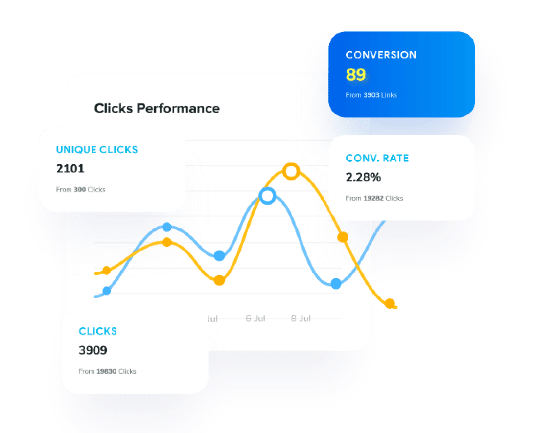
Unlock the potential of your call-to-action (CTA) using Replug’s powerful analytics. Gain valuable insights into the effectiveness of your CTA by tracking and measuring key metrics. Replug provides comprehensive data on:
Click-through rate (CTR): Measure the number of clicks your CTA receives. A high CTR indicates an engaging CTA that prompts users to take action.
Conversion rate: Evaluate the success of your CTA in driving desired actions, such as purchases or sign-ups. A high conversion rate signifies an effective CTA leading users to conversion.
Bounce rate: Understand how many visitors leave your page after viewing a CTA. A high bounce rate suggests the need for a more relevant and compelling CTA to retain user interest.
Time on page: Assess the amount of time users spend on a page with your CTA. A low time on a page could indicate the need for a more engaging CTA or additional information to captivate users.
A/B testing: Compare two versions of your CTA (A and B) to determine which performs better. Replug enables you to measure and compare metrics, identifying the most effective CTA for driving conversions.
To effectively gauge CTA performance, define clear goals, understand your target audience, and tailor your CTA accordingly. With Replug’s insights, optimize your CTAs for maximum impact and drive superior results.
Conclusion:
Discard the conventional rulings and design intuitive, more compelling CTAs for your audience.
Get them hooked on your products and services by resonating with their cognitive needs. Make your CTAs stand out by choosing smart color schemes for your CTAs. Create a story for your customers to make their exploration of your website purposeful.
The placement of the CTA is as important as its design. Carefully contextualize your CTA’s placement and make your users’ journey a seamless one.
Wasiq Naeem is a content and digital marketing veteran who is passionate about his writing. Extensive research and producing high-quality content is just another day at the office for him.
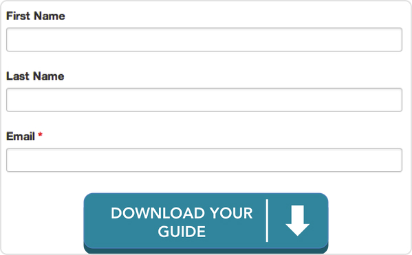
A call-to-action (CTA) is a button or a link on a website or an email that encourages visitors to take a specific action. Such as purchasing a product or signing up for a newsletter.
The purpose of a CTA is to guide visitors toward a goal conversion, such as completing a purchase or filling out a form. CTAs should be visually attractive and easy to spot so visitors can quickly and efficiently take the desired action. Strong CTAs can lead to maximum conversions, while weak CTAs may not be effective in guiding visitors to take action.
How to create a custom CTA using Replug?
Replug is a powerful tool that allows you to easily create a custom CTA for your website. With its user-friendly interface, you can quickly design CTAs that match your brand’s style and aesthetic by adding colors, fonts, and other design elements.
Replug also comes with analytics features that allow you to track the performance of your CTAs and conduct A/B testing to determine which versions are most effective. This means you can optimize your CTA for a better conversion rate and increase your website’s performance.
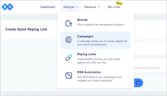
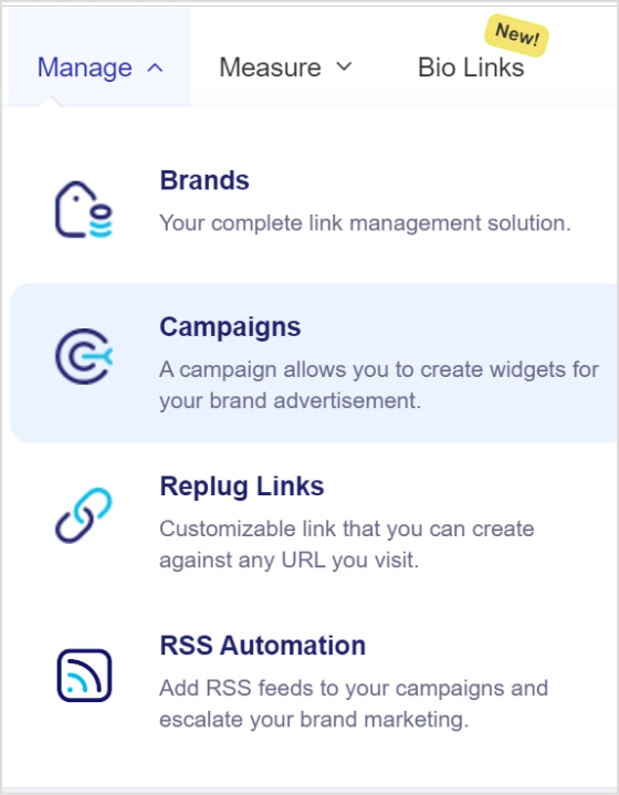
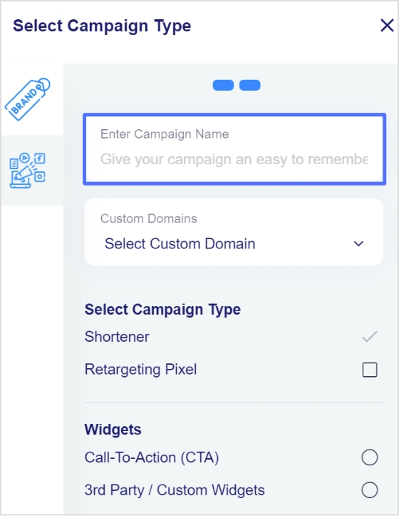
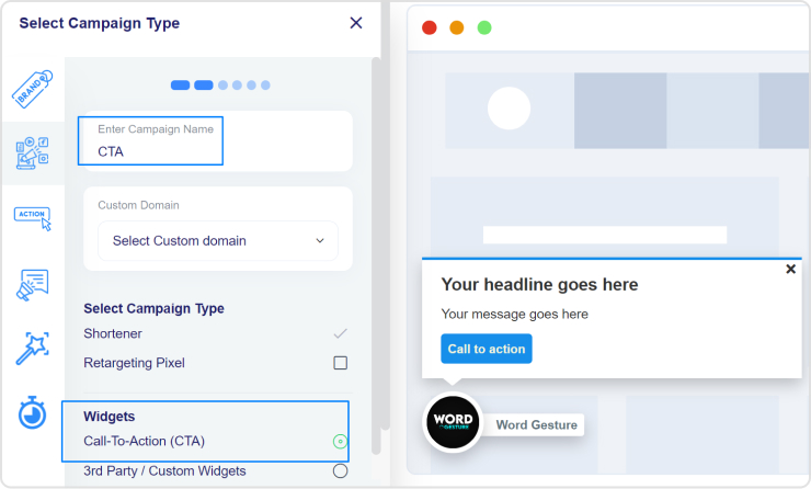
Step 2: Go to the manage section on the main dashboard and click campaigns.
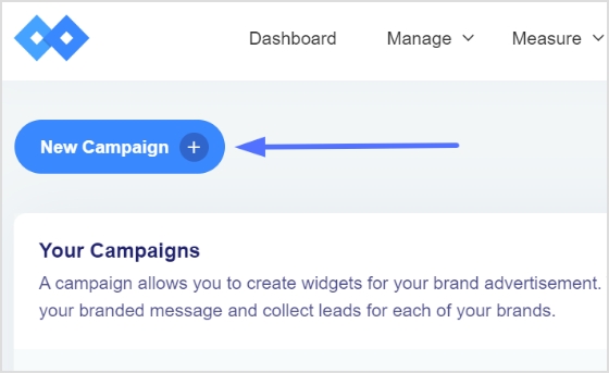
Step 3: Click the new campaign button to start your new CTA campaign. Or you can select a campaign from the campaigns section if you have already created one.
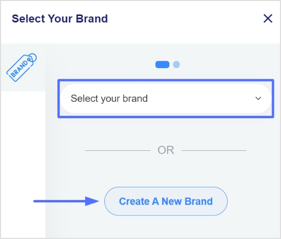
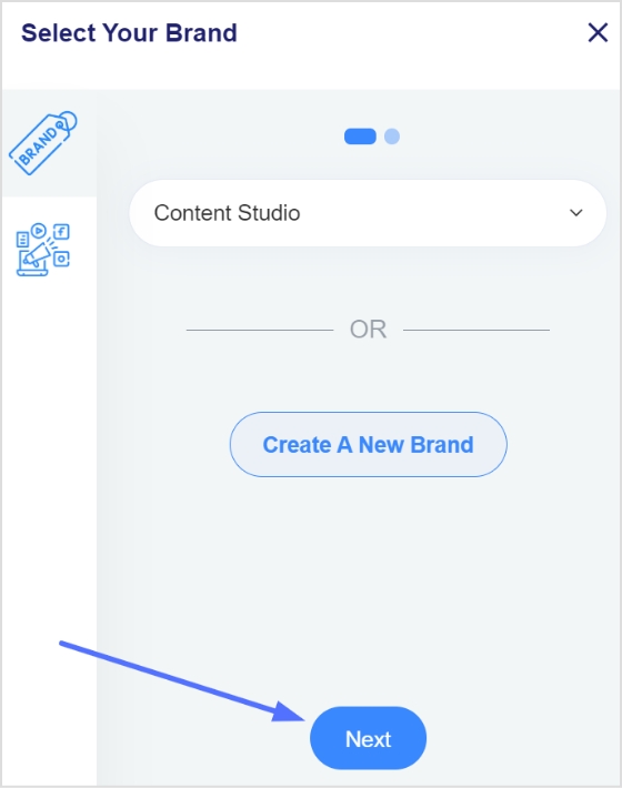
Step 4: After creating your campaign, you need to select your brand, or you can create a new one. Once selected or created a new brand, click the next button.
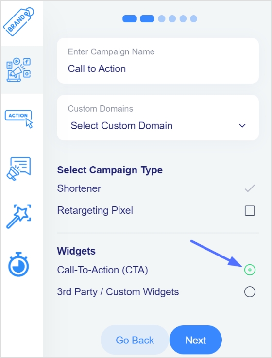
Step 6: Enter your campaign name, enable the call to action (CTA) and click next.
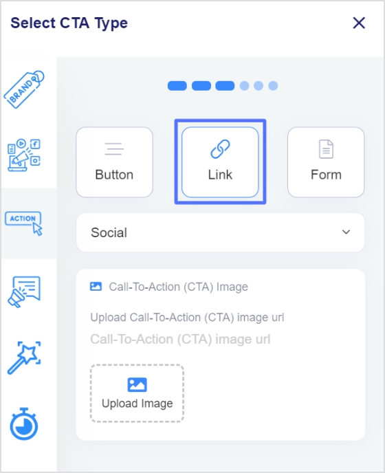
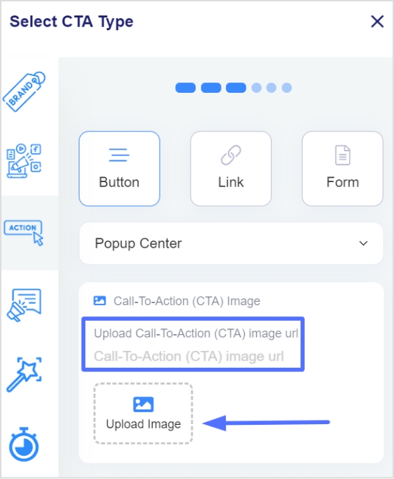
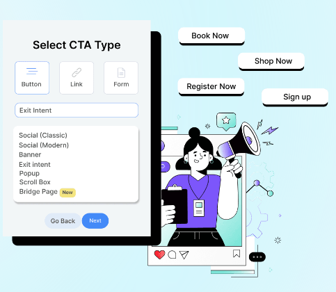
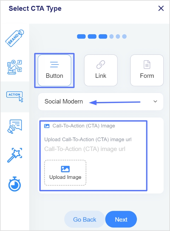
Step 7: Here, you need to select the CTA type and theme. And upload an image for your CTA, then click next.
CTA types include; Button CTA, Link CTA, or Form CTA.
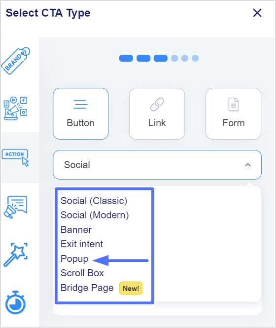
CTA theme includes; Social classic, Social modern, Banner, Exit intent, Popup, Scroll box, and Bridge page.
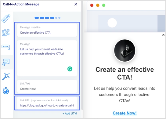
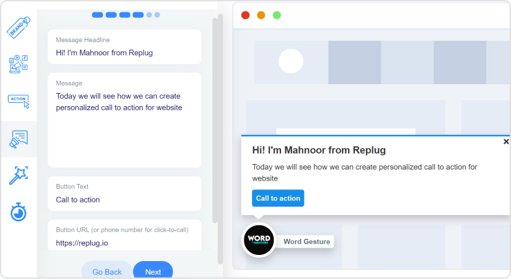
Step 8: Next step is to enter the headline, message, CTA button text, and the actual link to your CTA button, then click next.
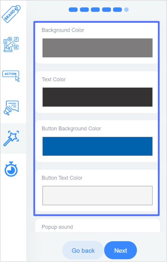
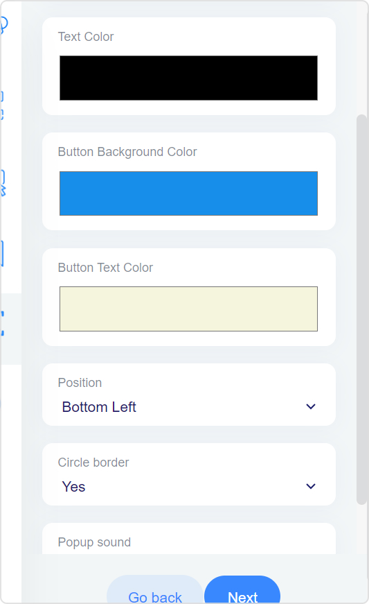
Step 9:Customizing your CTA is the next step.
Add background colors, text colors, and CTA button colors. See other customizing options and click next.
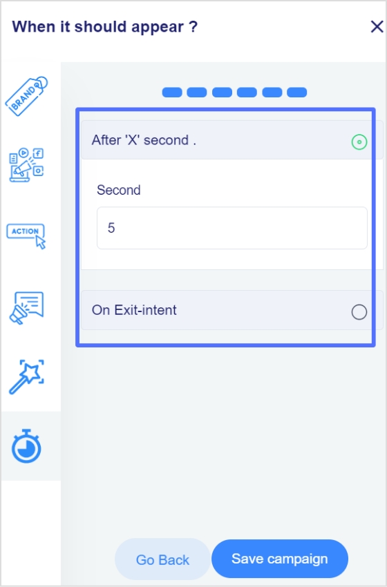
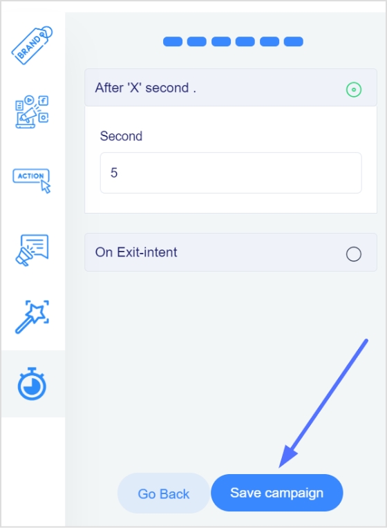
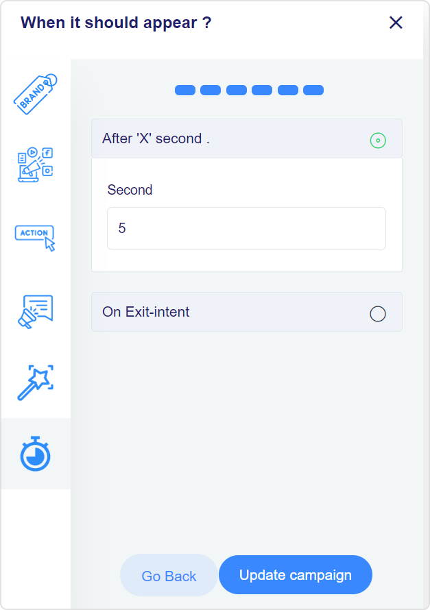
Step 10: Choose the time after which your CTA appears on your website.
Alternatively, you can make your CTA appear when the user wants to exit by enabling the “exit intent” option.
Click the save campaign button, and you’re done.
Analyze your CTA’s performance using Replug:
Replug helps you analyze the performance of a call-to-action (CTA). With Replug, you can track and measure specific metrics. These metrics can include the following:
Click-through rate (CTR): Replug measures the number of clicks a CTA receives. A high CTR indicates that the CTA effectively motivates users to act.
Conversion rate: with Replug, you can measure the number of successful conversions (e.g., completed a purchase or sign-up). A high conversion rate indicates that the CTA leads users down the desired conversion path.
Bounce rate: It measures the number of visitors who leave a website after viewing only one page. A high bounce rate on a page with a CTA could indicate that the CTA needs to be more relevant and compelling to users.
Time on page: This measures the time a user spends on a page before leaving. A low time on a page with a CTA could indicate that the CTA needs to be more engaging users or that the page needs to provide more information to keep users interested.
A/B testing: It compares two versions of a CTA (A and B) to determine which one performs better. With Replug, you can measure the compare the metrics of both versions. Also, you can identify which CTA is more effective in driving conversions.
It is important to note that you need to have clear goals and objectives for your CTA and a clear understanding of your target audience and their needs to effectively measure the performance of a CTA.
Hubspot and Replug: why should you use them together?
HubSpot is a marketing, sales, and service software that allows you to manage all aspects of your inbound marketing efforts, including creating and tracking CTAs. It provides many features, such as landing pages, forms, email campaigns, and analytics. It also allows you to track the performance of your CTAs and optimize them for better results.
Using Replug with HubSpot can be beneficial as it allows you to:
Track clicks on the shortened link using a link-tracking tool and see the number of clicks and the source of the clicks.
Create an easy-to-remember and share links for social media or messaging apps.
Track conversions using UTM parameters (Urchin Tracking Module) which allow you to track the source, medium, and campaign of the clicks that came from the link.
Arslan is a SaaS content marketer who crafts clear, engaging content that drives results. He simplifies complex ideas into easily understandable blog posts, landing pages, and emails, helping SaaS companies connect with their audience and grow.
An effective call to action directs audiences to take a specific action, which can lead to sales or conversions. A call-to-action generator helps you increase engagement and lead generation and drive traffic to a website. Therefore, CTAs are an essential part of any marketing or sales strategy as they help to convert leads into customers.
Why make CTAs using a link shortener?
Creating a call to action (CTA) using a link shortener has several benefits.
Shortened links are more visually appealing and take up less space, making audiences more likely to click on them.
Additionally, link shorteners provide analytics and tracking features, enabling you to track how many people click on your CTA. This helps in understanding the effectiveness of the CTA and the engagement of the audience.
Lastly, CTAs also help make the link more manageable, especially when it’s shared on social media platforms where the character limit is a constraint.
Overall, a link shortener in a CTA can help increase click-through rates. Also, it makes tracking the CTA’s performance easier, which is crucial for any marketing or sales strategy.
Step 9: After selecting the CTA type, you need to select the theme for your CTA. Your CTA’s appearance depends on your CTA’s purpose. As for this case, we have chosen a scroll box CTA theme.
Step 10: Enter your URL and upload an image for the CTA, then click Next.
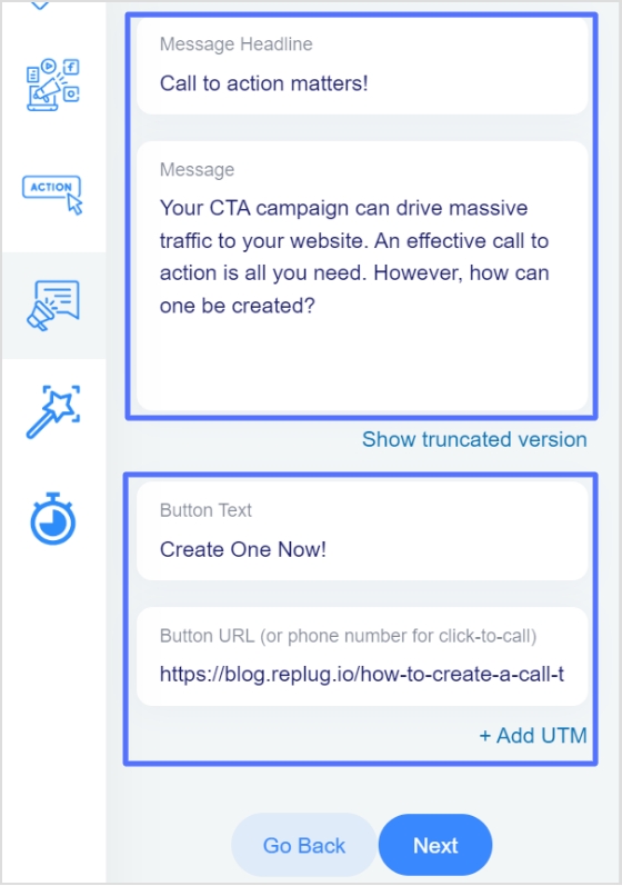
Step 12: You are now in the CTA message section.
Write your headline, message, and CTA button text. And enter the URL of the CTA in the last block.
Note: You can also preview the CTA side by side, as shown below.
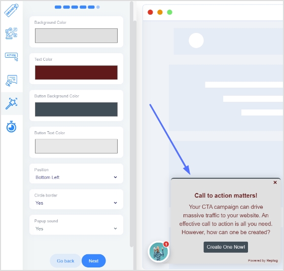
Step 14: You’re now in the CTA customization section, where you can add colors. (Background colors, text colors, CTA button background colors, CTA button text colors). Choose your colors and click next.
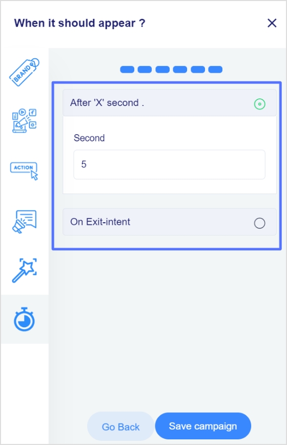
Step 15: In the final step, you will select the seconds, after which the CTA will be displayed to the user.
Alternatively, you can select the “On exit-intent” option to display the CTA when the user wants to exit the page.
Step 16:Save the campaign; now, you can share it across other platforms. Ensure that your newly created campaign appears in the campaigns section.
Replug can also assist you with tracking the performance of a “call-to-action” (CTA) on a website. It provides analytics features enabling users to monitor the number of clicks a CTA receives. This information can be used to evaluate which CTAs are most successful and adjust marketing strategies accordingly.
Arslan is a SaaS content marketer who crafts clear, engaging content that drives results. He simplifies complex ideas into easily understandable blog posts, landing pages, and emails, helping SaaS companies connect with their audience and grow.
Amplify Your Marketing With Optimized Link Sharing
Over 35,000+ marketers, agencies, businesses, e-commerce stores and brands optimize and track their links using Replug and get better returns on their marketing efforts.


 Mahnoor Shahid


 Wasiq Naeem


 Arslan Jadoon